» About » Archive » Submit » Authors » Search » Random » Specials » Statistics » Forum » RSS Feed Updates Daily
No. 4692: Wombofield Dream
First | Previous | 2022-03-24 | Next | Latest

First | Previous | 2022-03-24 | Next | Latest
Permanent URL: https://mezzacotta.net/garfield/?comic=4692
Strip by: David Morgan-Mar
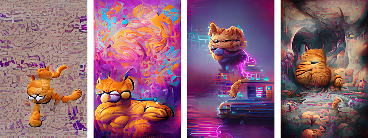
{An misshapen Garfield plush is falling over a backdrop of irregular grey and purple shapes}
{A bulbous blob vaguely reminiscent of Garfield is seated in front of a heavily saturated backdrop of purple, blue and orange globs}
{A disturbingly unnatural Garfield head is floating above a car-like construction amidst a backdrop of heavily vapourwave-styled neon and purple colours}
{A Garfield-like wrinkled flesh creature sits facing away from the viewer, with its possible offspring by its side, on a backdrop of a pastel-coloured surreal landscape of undulations}
The author writes:
Jumping on the bandwagon which currently has everyone using Wombo Dream to make computer generated art and posting it all over the Internet, of course the obvious application is to make an AI-generated Garfield strip.
I used the prompt words "garfield cat" and took the first four images it produced to assemble this.
Points of interest:
Obviously Wombo has sourced images from the 2004 Garfield movie as inspiration for its fevered electronic dreams. There doesn't seem to be any discernible trace of the comic strip version of our favourite feline. This leads me to conclude that the image sourcing algorithm rejects line artwork and flat colour (such as clip art) in favour of photographic (or photorealistic) images. Which is fair enough, given the art styles that it is aiming to emulate.
The colour orange features heavily, as expected. However all four of these images also show a preponderance of purple. Initially I had no idea where that was coming from, as a few Google image searches for Garfield movie images or the string "garfield cat" don't really show much purple anywhere.
However, a few experiments with different prompt words that heavily imply a colour (e.g. "Smurf") show that Wombo tends to favour contrasting colour schemes. In fact, it seems to make heavy use of colours on the exact opposite side of the colour wheel to the colour suggested by the prompt. So I postulate that the programmers have done this deliberately to produce images with high colour contrast that would appeal to users.
