A couple of months ago I wrote about a colour naming experiment that I was planning to perform with the students in the Science Club that I volunteer to teach at a local primary school. You may want to go back and review that post, as today I’m going to talk about the results of the experiment.
I go back to teach the Science Club again next Monday, so it was time to sit down and analyse the results. I went through the answer sheets that the children filled (there were 12 of them, one of the students was sick that day) in and typed the names of each colour from each child into a spreadsheet. I thought it could accumulate the totals and make pie charts for me, but I discovered that I needed to manipulate the data first using a COUNT() function or something. While pondering whether to do this or to export all the data to CSV and write a Python program to do the gruntwork, one of my friends pointed me at this pertinent xkcd comic.
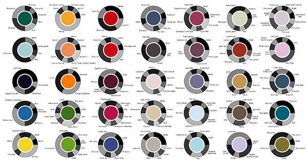
That inspired me to do all the processing in Python, and I discovered to my pleasant surprise that my machine already had the matplotlib library installed, so I could produce pie charts directly from Python. (Without sucking the munged data back into a spreadsheet again to to the graphs as I feared I might have to do.) Anyway, long story short, here are the results (click the image for a huge readable version):
[I should point out that of course the colours in this image as displayed on your computer screen are not exactly the same as the colours printed on the paint sample charts that I assembled and gave to the children, because of the vagaries of colour calibration of monitors and the limited colour gamut of the graphic file format. Consider them only an approximation of what the children actually saw.]
That’s a lot to digest. Here are some highlights:
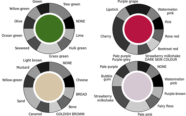
Firstly, here are the colours for which the largest number of people agreed on the name:

Out of 12 people, three colours had 7 of them agree on what the colour should be called, and one colour had 6 people agree. There was no colour in the entire sample for which a 2/3 majority agreed on the name, let alone anything approaching unanimity. 31 of the 35 colours sampled had less than half the people agree on the name of the colour.
At the other end of the spectrum (ha ha!), here are the colours that had the most different names assigned:

Four colours had, in a sample of just 12 people, nine different colour names assigned to them. Three of these colours also had one or two students unable to decide on a name in the time allowed, and they left it blank on the answer sheet.
I should point out that names that were on the answer sheet are written in lower case with an initial capital, while names that the students chose to write-in are written in all-capitals, and “NONE” indicates a student who didn’t give that colour any name. I gave them what I thought was a generous amount of time, but some of the students complained that it was too difficult and obviously struggled to complete the task. I did ask them beforehand if any of them knew they were colourblind, and none of them did. While there are two or three somewhat bizarre names assigned (“brown” for the colour that most kids identified as “lavender” for example), I don’t see any real evidence that any of them are indeed colourblind (confusing reds and greens, for example).
Another thing you’ll notice if you examine the large image of all the pie charts is that the same colour word is used for several different colours, many times over. For example, “olive” is used to describe three different shades of green, as is “tree green”, while “carrot” is used to describe three different shades of orange, “turquoise” is used for three different shades of blue, and so on.
The conclusion from all of this? This basically confirms the research findings that I quoted in the first post on this experiment – that people are incredibly inconsistent when it comes to naming colours. If you say “olive”, or “carrot”, or “turquoise”, people have a reasonable general idea what sort of colour you mean, but many will not be thinking of the same shade of colour that you will, and will fail to pick it out of a line-up.
The second part of the experiment – showing that people are inconsistent with themselves would require me to ask the children to do this entire task a second time. I was planning on doing this, but given how much some of them complained about it the first time, I think I’ll spare them doing it again, and do something a bit more fun with them instead. Hopefully however, when I show them the results on Monday they’ll think it’s pretty amazing and cool, like I do.

What, you mean that Xkcd comic didn’t inspire you to post the data to a web page, then hop over to Google, import that web page into Sheets, and program an SQL query to do the calculations?
Heh. Now that I think about it seriously, I could have done that… But gah…
Was this meant for one of your other blogs?
No, this is a general science blog as well as topics focused on the “100 Proofs” thing.
Ah. Sorry, I have a bad habit of taking things too literally.