40. Falling objects

What could be more simple than dropping an object and watching it fall to the ground? Our everyday experience shows that if you drop something, it falls straight down.

The Ancient Greek philosopher Aristotle used this observation to show that the Earth cannot possibly be moving or rotating. If the Earth were rotating from west to east, as some rival philosophers argued, then when you drop something, the Earth will move eastwards underneath it as it falls, and the object should land some distance west of where you dropped it! We don’t see this happening, ergo, the Earth cannot possibly be moving. Q.E.D.

Aristotle of course got many things wrong in his proposed system of the mechanics of motion and how the cosmos worked – a system known now as Aristotelian physics. Among his other contentions were that heavier objects fall faster than lighter ones, and that an object cannot undergo “unnatural motion” unless acted on by a force (falling is a “natural motion” and therefore requires no force).

One consequence of strict Aristotelian physics is that as soon as an object is released, it can have no sideways motion, and must fall straight down. This is obviously false if you observe objects such as arrows or cannonballs in flight, and natural philosophers of the Middle Ages developed the concept of impetus to explain this. The basic idea is that when a force propels an object, it implants in that object an impetus, which acts as an inherent force within the object itself, pushing it onwards. The concept took several centuries to mature, and was formalised by the French philosopher Jean Buridan in the 14th century (perhaps more famous for Buridan’s ass, which was not his backside, but a philosophical paradox).

Archer firing an arrow

An arrow fired by an archer. The arrow does not drop straight to the ground as soon as it leaves the bow, contrary to Aristotelian physics. (Public domain image from Wikimedia Commons.)

Impetus is a forerunner of how Isaac Newton eventually solved the problem, with his idea of momentum and his Laws of Motion. Newton’s First Law says that an object at rest, or in a state of uniform motion, maintains that state unless acted on by an external force. So an object like an arrow that is fired from a bow at some speed maintains that speed unless acted on by external forces. In practice there are two forces acting on a flying arrow: air resistance, which slows down its horizontal motion, and gravity (another of Newton’s cool ideas), which causes it to begin falling towards the ground. The combination of these two results in the arrow slowing down and dropping in altitude, until eventually it hits something (either a target or the ground).

Newton’s First Law also explains why a dropped object falls straight to the ground, instead of falling to the west as the Earth rotates beneath it. An object held in your hand has the same rotational velocity as the Earth at the point where you’re standing. For example, if you’re on the equator, the rotational speed of the Earth’s surface is about 460 metres per second, so you and anything you’re holding, are moving eastwards at that speed. When you let the object go, it continues moving at 460 m/s eastward as it falls – the same speed as the Earth is moving. And so it falls at your feet, what appears to be directly downwards to you, with no sideways deflection.

Or does it?

Dropping a tennis ball

Dropping a tennis ball. Where does it land? (Creative Commons Attribution 2.0 image by Marco Verch, from Flickr.)

If the Earth were flat and non-rotating, then none of this would be an issue. Objects dropped fall downwards and the non-motion of the Earth doesn’t change anything. You don’t even need Newton’s First Law.

If the Earth were flat and rotating like a record (or optical disc) about a central North Pole, things get a little more complicated. Let’s say the equator is 10,000 km from the North Pole (the same as on our Earth), and the Flat Earth rotates once per 24 hours. Then points on the equator are moving with a speed of 2π×10000/(24×60×60) km/s = 727 m/s (faster than our spherical Earth because the geometry is different). If you drop an object (and believe Newton’s laws), the object is moving east at 727 m/s and maintains that motion in a straight line as it falls. Let’s say you drop it from a height of 2 metres. It takes 0.64 seconds to hit the ground. In 0.64 seconds, the object moves east a distance of 465 metres. The ground is also moving east at 727 m/s, however, the ground is not moving in a straight line – it’s moving in a circle about the North Pole. In 0.64 seconds the ground moves through an angle of 0.0027°. Doing the trigonometry, this means the ground moves 465×cos(0.0027°) m east (which is slightly less than, but so close to 465 m that it’s not worth writing the difference) and 465×sin(0.0027°) m north, which equals 0.022 metres. So, if we live on a rotating Flat Earth, and you drop an object from 2 metres height at the equator, you should see it land 22 millimetres south of straight down.

Dropping objects on a rotating flat Earth

On a rotating Flat Earth, if you drop an object on the equator (green dot, left), both the Earth and the object at that point are moving west to east. As the object falls, the Earth rotates (right). The location on the Earth where you dropped the object moves in a circle (green dot), but the falling object moves in a straight line and lands at the red dot, south of the starting location.

This is a prediction of the rotating Flat Earth model. Repeating the above calculations for different latitudes (assuming distances from the North Pole equal to our round Earth), we would expect a southward deflection of 11 mm at 45° north, or 33 mm at 45° south. Do we observe such a southward deflection of falling objects? No, we don’t.

Now let’s think about our spherical Earth, because things are not quite as straightforward as they might appear. The equator is rotating at a speed of 460 m/s. It’s not moving in a straight line – it’s rotating about the Earth’s axis, once every sidereal day: T = 23 hours, 56 minutes, 4 seconds (see 36. The visible stars). The radius of rotation is the equatorial radius of the Earth: 6378.1 km. If you hold an object 2 metres above the ground, its radius of rotation is 2 metres larger, making the distance it has to travel in a sidereal day 4π metres larger. So the speed of rotation 2 metres above the ground is 4π/T = 0.000145 m/s faster than the ground. In 0.46 seconds, this means that an object 2 metres above the ground moves eastward by 0.067 millimetres greater distance than the ground does.

So if you stand on the equator and drop an object from 2 metres, it should land 0.067 mm east of straight down. If you increase the height and drop an object from 100 metres, it takes 4.52 seconds to fall and by this calculation should land 33 mm east of straight down. The German language Wikipedia has an article on this calculation (there is no English Wikipedia article on it), and derives the same result, but then it says that “a more precise calculation” produces an additional factor 2/3, citing Carl Friedrich Gauss’s collected works without any further explanation. So this gives a deflection of 22 mm for an object dropped from 100 m. There is also an adjustment for latitude, being the usual cosine(latitude) term that we have seen in many of these discussions.

This is a prediction of the rotating spherical Earth model. Do we observe such an eastward deflection of falling objects?

There is in fact a long history of scientists investigating this effect and trying to measure it. In 1674, the French Jesuit priest and mathematician Claude François Milliet Dechales published his Cursus seu Mondus Matematicus, which included a diagram showing the fall of an object from a tower on the rotating Earth. It’s not clear if he ever performed the experiment.

Diagram of dropping object from a tower

Diagram from Dechales’s Cursus seu Mondus Matematicus showing an object F falling from a tower FG. As the Earth rotates the tower FG moves to HI, but the object does not land at I, it lands further east at L. (Public domain image from Wikimedia Commons.)

Isaac Newton himself wrote about the effect in a letter to Robert Hooke, dated 28 November, 1679, just five years later[2].

Newton's letter to Robert Hooke

Newton’s letter of 28 November 1679 to Robert Hooke. Larger version. (Pages reproduced from [2].)

In the letter, Newton drew a diagram of an object falling, not just from a height to the ground, but continuing to fall towards the centre of the Earth (as if the object could pass through the Earth):

Diagram from Newton's letter

Enlargement of the diagram from Newton’s letter.

In the text accompanying the diagram Newton writes:

Then imagine this body be let fall and its gravity will give it a new motion towards the centre of the Earth without diminishing the previous one from west to east. Whence the motion of this body from west to east, by respect that before its fall it was more distant from the centre of the Earth than the parts of the Earth at which it arrives in its fall, will be greater than the motion from west to east of parts of the Earth at which the body arrives in its fall, and therefore it will not descend the perpendicular AC, but outrunning the parts of the Earth will shoot forward to the east side of the perpendicular, describing in its fall a spiral line ADEC.

Newton goes on to suggest that a “descent of but 20 to 30 yards” may be enough to observe the eastward deflection. Being a theoretician, Newton doesn’t seem to have done the experiment, but Hooke tried to measure the eastward deflection of an object falling from a height of 8.2 metres. From this height the expected deflection is about a quarter of a millimetre at the latitude of London—very difficult to measure—and Hooke’s results were inconclusive.

The first positive result was achieved in 1791 by Italian scientist Giovanni Battista Guglielmini. He dropped a total of 16 balls from the top of the Asinelli Tower of Bologna, a height of 78 m, comparing the landing positions to a vertical defined by a plumb-bob line. He concluded that the average eastward deflection of the balls was about 18 mm, compared to a predicted deflection of 11 mm.[3] Of course, these early experiments faced many difficulties, such as air currents, the difficulty of releasing the balls without any sideways motion, and measuring a vertical plumb line accurately.

In 1802, Johann Benzenberg dropped 32 balls from the tower of St Michael’s Church in Hamburg, 76 m high. Being at a higher latitude than Bologna, the expected eastward deflection was 8.7 mm, and Benzenberg recorded an average value of 9 mm. In 1831, Ferdinand Reich dropped lead balls 158  metres down the Drei Brüders (Three Brothers) mine shaft near Freiberg, measuring 28 mm eastward deflection, with a predicted value of 29.4 mm. In 1902 Edwin Hall performed the experiment with 948 separate drops from a height of 23 m at Harvard University, measuring an eastward deflection of 1.5 mm, compared to the predicted 1.8 mm. And Camille Flammarion dropped 144 balls from 68 m in the Pantheon in Paris, measuring a deflection of 6.3 mm, compared to the theoretical 8.1 mm.[3]

This is not an easy experiment to perform with sufficient accuracy. It is sensitive to a lot of complicating factors, particularly air currents, but the overall agreement of observation with the predictions is good. And so the measurable eastward deflection of falling objects provides us with another proof that the Earth is a (rotating) globe.

Note: I’ve talked only about the eastward deflection of falling objects. There is also a smaller predicted deflection in the north-south direction for latitudes away from the equator. That will be discussed in a future Proof.

References:

[1] Dechales, C. F. M. Cursus seu mundus mathematicus (Vol. 1), 1674.

[2] Gunther, R. T. Early Science in Oxford, Volume X, Oxford University Press, Oxford, 1920-1937. https://archive.org/details/earlyscienceinox10gunt/page/52/mode/2up

[3] Tiersten, M., Soodak, H. “Dropped objects and other motions relative to the noninertial earth”. American Journal of Physics, 68, p. 129-142, 2000. https://doi.org/10.1119/1.19385

39. Seismic wave propagation

Our planet is made largely of rocks and metals. The composition and physical state varies with depth from the core of the Earth to the surface, because of changes in pressure and temperature with depth. The uppermost layer is the crust, which consists of lighter rocks in a solid state. Immediately below this is the upper mantle, in which the rocks are hotter and can deform plasticly over millions of years.

Slow convection currents occur in the upper mantle, and the convection cells define the tectonic plates of the Earth’s crust. Where mantle material rises, magma can emerge at mid-oceanic ridges or volcanoes. Where it sinks, a subduction zone occurs in the crust.

The plate boundaries are thus particularly unstable places on the Earth. As the plates shift and move relative to one another, stresses build up in the rock along the edges. At some point the stress becomes too great for the rock to withstand, and it gives way suddenly, releasing energy that shakes the Earth locally. These are earthquakes.

Lisbon earthquake engraving

Engraving of the effects of the 1755 Lisbon earthquake. (Public domain image from Wikimedia Commons.)

The point of slippage and the release of energy is known as the hypocentre of the earthquake, and may be several kilometres deep underground. The point on the surface above the hypocentre is the epicentre, and is where potential destruction is the greatest. Most earthquakes are small and go relatively unnoticed except by the seismologists who study earthquakes. Sometimes a quake is large and can cause damage to structures, injuries, and loss of life.

The energy released in an earthquake travels through the Earth in the form of waves, known as seismic waves. There are a few different types of seismic wave.

Primary waves, or P waves, are compressional waves, like sound waves in air. The rock alternately compresses and experiences tension, in a direction along the axis of propagation. In fact P waves are essentially sound waves of very large amplitude, and they propagate at the speed of sound in the medium. Within surface rock, this is about 5000 metres per second. Primary waves are so called because they are the fastest seismic waves, and thus the first ones to reach seismic recording stations located at any distance from the epicentre. They travel through the body of the Earth. And like sound waves, they can travel through any medium: solid, liquid, or gas.

Secondary waves, or S waves, are transverse waves, like light waves, or waves travelling along a jiggled rope. The rock jiggles from side to side as the wave propagates perpendicular to the jiggling motions. S waves travel a little over half the speed of P waves, and are the second waves to be detected at remote seismic stations. S waves also travel through the body of the Earth, but only within solid material. Fluids have no shear strength, and so cannot return to an equilibrium position when a transverse wave hits it, so the energy is dissipated within the fluid.

Seismic wave types

Illustrations of rock movement in different types of seismic waves. (Figure reproduced from [1].)

Besides these two types of body waves, there are also surface waves, which travel along the surface of the Earth. One type, Rayleigh waves (or R waves, named after the physicist Lord Rayleigh), are just like the surface waves or ripples on water, and causes the surface of the Earth to heave up and down. Another type of surface wave causes side to side motion; these are known as Love waves (or L waves, named after the mathematician Augustus Edward Hough Love). These waves propagate more slowly than S waves, at around 90% of the speed. Love waves are generally the strongest and most destructive seismic waves.

The P and S waves are thus the first two waves detected from an earthquake, and they are easily distinguishable on seismometer recordings.

Seismogram of P and S waves

Seismogram recording of arrival of P waves and S waves at a seismology station in Mongolia, from an earthquake 307 km away. (Figure reproduced from [2].)

The P waves arrive first and produce a pulse of activity which slowly fades in amplitude, then the S waves arrive and cause a larger amplitude burst of activity. Because the relative speeds of the two waves through the same material are known, the time between the arrival of the P and S waves can be used to determine the distance from the seismic station to the earthquake hypocentre, using a graph such as the following:

Seismic wave travel-time curves

Seismic wave travel-time curves for P, S, and L waves. Also shown are three seismograms detected at seismic stations at different distances from an earthquake. (Public domain image from the United States Geological Survey.)

The graph shows the travel times of P, S, and also L waves, plotted against distance from the earthquake on the vertical axis. As you can see, the time between the detection of the P and S waves increases steadily with the distance from the quake.

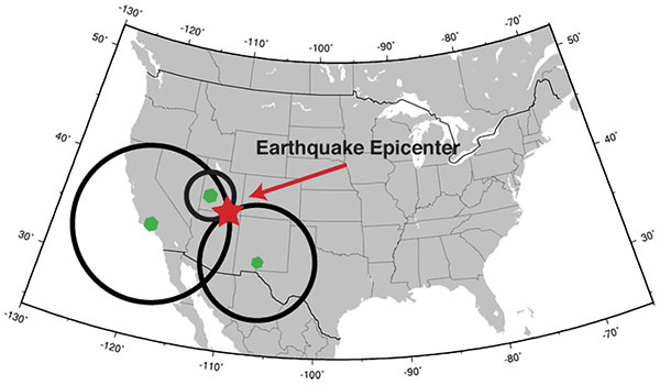
If you have three seismic stations, you can triangulate the location of the epicentre (using trilateration, as we have previously discussed).

Triangulating the location of an earthquake

Triangulating the location of an earthquake using distances from three seismic stations. (Public domain image from United States Geological Survey.)

Of course, if you have more than three seismic stations, you can pinpoint the location of the earthquake much more reliably and precisely. According to the International Registry of Seismograph Stations, there are over 26,000 seismic stations around the world.

Location of seismic stations

Location of seismic stations recorded in the International Registry of Seismograph Stations. (Figure reproduced from [3].)

Interestingly, notice how the world’s seismic stations are concentrated along plate boundaries, where earthquakes are most common, particularly around the Pacific rim, as well as heavily in the developed nations of the US and Europe.

As shown in the travel-time curve graph, you can also use the propagation time of L waves to estimate distance to the earthquake. Did you notice the difference between the shapes of the P and S wave curves, and the L wave curve? L waves travel along the surface of the Earth. The distance from an earthquake to a detection station is measured conventionally, like everyday distances, also along the surface of the Earth. Since the L waves propagate at a constant speed, the graph of distance (along the Earth’s surface) versus time is a straight line.

But the P and S waves don’t travel along the surface of the Earth. They propagate through the bulk of the Earth. The distance that a P or S wave needs to travel from earthquake to detection site increases more slowly than the distance along the surface of the Earth, because of the Earth’s spherical shape. The S waves are only about 10% faster than the L waves, and you can see that near the epicentre, they arrive only around 10% earlier than the L waves. But the further away the earthquake is, the more of a shortcut they can take through the Earth, and so the faster they arrive, resulting in the downward curve on the graph. Similarly for the P waves.

This is in fact not the only cause of the P and S waves appearing to get faster the further away you are from an earthquake. They actually do get faster as they travel deeper, because of changes to the rock pressure. Deep in the Earth they can travel at roughly twice the speed that they do near the surface. The combination of these effects causes the shape of the curves in the travel-time graph.

If we consider the propagation of seismic waves from an earthquake, they spread out in circles around the epicentre, like ripples in a pond from where a stone is dropped in. The arrival times of the waves at seismic stations equidistant from the epicentre should be the same, since the speeds in any direction are the same. And this is of course what is observed. The following figures show the predicted spread of P waves across the Earth from earthquake epicentres in Washington State USA, near Panama, and near Ecuador, as plotted by the US Geological Survey.

P wave propagation times from Washington

Predicted P wave propagation time in minutes from an earthquake epicentre in Washington State, USA. (Public domain image from United States Geological Survey.)

P wave propagation times from Panama

Predicted P wave propagation time in minutes from an earthquake epicentre near Panama. (Public domain image from United States Geological Survey.)

P wave propagation times from Ecuador

Predicted P wave propagation time in minutes from an earthquake epicentre near Ecuador. (Public domain image from United States Geological Survey.)

These maps are shown on an equirectangular map projection, which of course distorts the shape of the surface of the Earth (as discussed in 14: Map projections). To get a better idea of how the seismic waves propagate, we need to project these maps onto a sphere.

P wave propagation times from Washington, globe

Predicted P wave propagation time in minutes from an earthquake epicentre in Washington State, USA, projected onto a globe.

P wave propagation times from Panama, globe

Predicted P wave propagation time in minutes from an earthquake epicentre near Panama, projected onto a globe.

P wave propagation times from Ecuador, globe

Predicted P wave propagation time in minutes from an earthquake epicentre near Ecuador, projected onto a globe.

In these projections, you can see that the seismic wave travel time isochrones are circles, spreading out around the globe from the epicentres.

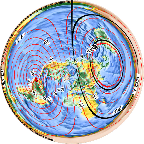
At least, the waves spread out in circles on a spherical Earth. In a flat Earth model, such as the typical “north pole in the middle” one, the spread of seismic waves produces elongated elliptical shapes or kidney shapes (such as the ones drawn in 23: Straight line travel), for no apparent or explicable reason.

P wave propagation times from Washington, flat Earth

Predicted P wave propagation time in minutes from an earthquake epicentre in Washington State, USA, projected onto a flat Earth.

P wave propagation times from Panama, flat Earth

Predicted P wave propagation time in minutes from an earthquake epicentre near Panama, projected onto a flat Earth.

P wave propagation times from Ecuador, flat Earth

Predicted P wave propagation time in minutes from an earthquake epicentre near Ecuador, projected onto a flat Earth.

Why should seismic waves propagate more slowly towards or away from the North Pole, and faster along tangential arcs? Why would they take longer to reach an area in the middle of the opposing half of the disc than to reach the far edge of the disc, which is further away? There is no a priori reason, and any proposed justification is yet another ad hoc bandage on the model.

So the propagation speeds of the various seismic waves and the travel times to recording stations provide another proof that the Earth is a globe.

Note: There is more to be said about the propagation of seismic waves, which will provide another, different proof that the Earth is a globe. Some readers no doubt have a good idea what it is already. Rest assured that I haven’t overlooked it, and it will be covered in detail in a future article.

References:

[1] Athanasopoulos, G., Pelekis, P., Anagnostopoulos, G. A. “Effect of soil stiffness in the attenuation of Rayleigh-wave motions from field measurements”, Soil Dynamics and Earthquake Engineering, 19, p. 277-288, 2000. https://doi.org/10.1016/S0267-7261(00)00009-9

[2] Quang, P. B., Gaillard, P., Cano, Y. “Association of array processing and statistical modelling for seismic event monitoring”, Proceedings of the 23rd European Signal Processing Conference (EUSIPCO 2015), p. 1945-1949, 2015. https://doi.org/10.1109/EUSIPCO.2015.7362723

[3] International Seismological Centre (2020), International Seismograph Station Registry (IR). https://doi.org/10.31905/EL3FQQ40

38. Lunar temperature modulation

Let’s start with a graph.

Latitude averaged temperature anomalies versus date

Graph of latitude averaged temperature anomalies (in degrees Celsius), from 1 April 1986 to 31 March 1987. (Figure reproduced from [1].)

This graph shows temperature anomalies on Earth – that is, the difference between the recorded temperature on any given day and the average temperature for the same location on that day over many years. Yellow-red colours indicate the actual temperature was warmer than average, blue-green colours indicate the temperature was cooler than average. The results are averaged across latitudes, so each point on the graph shows the average anomaly for the entire circle of latitude. The data are Goddard Television Infrared Observation Satellite Operational Vertical Sounder surface air temperature readings from NOAA polar weather satellites.

As you might expect, the temperature across Earth varies a bit. Some days are a bit warmer than average and some a bit cooler than average. You might imagine that with all of the different effects that go into the complicated atmospherical systems that control our weather, days would be cooler or warmer than average pretty much at random.

However that’s not what we’re seeing here. There’s a pattern to the anomalies. Firstly, the anomalies in the polar regions are larger (red and dark blue) than the anomalies in the mid-latitudes and tropic (yellow and light blue). Secondly, there are hints of almost regular vertical stripes in the graph – alternating bands of yellow and blue in the middle, and alternating red and dark blue near the poles. If you look at the graph carefully, you may be able to pick out a pattern of higher and lower temperatures, with a period a little bit less than one month.

What could have an effect on the Earth’s climate with a period a little under a month? The answer is, somewhat astonishingly, the moon.

The creators of this graph took the latitude-averaged temperature anomaly data for the 20 years from 1979 to 1998, and plotted it as a function of the phase of the moon:

Latitude averaged temperature anomalies versus lunar phase

Graph of latitude averaged temperature anomalies (in degrees Celsius), from 1979 to 1998, plotted against phase of the moon. (a) annual average, (b) October-March (northern winter), (c) April-September (northern summer). (Figure reproduced from [1].)

These graphs show that the temperature anomalies have a clear relationship to the phase of the moon. In the polar regions, the temperature anomaly is strongly positive around the full moon, and negative around the new moon. In the mid-latitudes and tropics the trend is not so strong, but the anomalies tend to be lower around the full moon and positive around the new moon – the opposite of the polar regions.

What on Earth is going on here?

Aggregated measurements show that the polar latitudes of Earth are systematically around 0.55 degrees Celsius warmer at the full moon than at the new moon. This effect is strong enough that it dominates over the weaker reverse effect of the mid-latitudes/tropics anomaly. The average temperature of the Earth across all latitudes is not constant – it varies with the phase of the moon, dominated by the polar anomalies, being 0.02 degrees Celsius warmer at the full moon than the new moon. That doesn’t sound like a lot, but the signal is consistently there over all sub-periods in the 20-year data, and it is highly statistically significant.

The next puzzle is: What could possibly cause the Earth’s average temperature to vary with the phase of the moon?

Well, the full moon is bright, whereas the new moon is dark. Could the moonlight be warming the Earth measurably? Physicist and climate scientist Robert S. Knox has done the calculations. It turns out that the additional visible and thermal radiation the Earth receives from the full moon is only enough to warm the Earth by 0.0007 degrees Celsius, nowhere near enough to account for the observed difference[2].

There’s another effect of the moon’s regular orbit around the Earth. According to Newton’s law of gravity, strictly speaking the moon does not move in an orbit around the centre of the Earth. Two massive bodies in an orbital relationship actually each orbit around the centre of mass of the system, known as the barycentre. When one body is much more massive than the other, for example an artificial satellite orbiting the Earth, the motion of the larger body is very small. But our moon is over 1% of the mass of the Earth, so the barycentre of the system is over 1% of the distance from the centre of the Earth to the centre of the moon.

It turns out the Earth-moon barycentre is 4670 km from the centre of the Earth. This is still inside the Earth, but almost 3/4 of the way to the surface.

Animation of lunar orbit

Animation showing the relative positions of the Earth and moon during the lunar orbital cycle. The red cross is the barycentre of the Earth-moon system, and both bodies orbit around it. Diagram is not to scale: relative to the Earth the moon is actually a bit larger than that (1/4 the diameter), and much further away (30× the Earth’s diameter). (Public domain image from Wikimedia Commons.)

The result of this is that during a full moon, when the moon is farthest from the sun, the Earth is 4670 km closer to the sun than average, whereas during a new moon the Earth is 4670 km further away from the sun than average. The Earth oscillates over 9000 km towards and away from the sun every month. And the increase in incident radiation from the sun during the phases around the full moon comes to about 43 mW per square metre, or an extra 5450 GW over the entire Earth. The Earth normally receives nearly 44 million GW of solar radiation, so the difference is relatively small, but it’s enough to heat the Earth by almost 0.01 degrees Celsius, which is near the observed average monthly temperature variation.

Why are the polar regions so strongly affected by this lunar cycle, while the tropics are weakly affected, and even show an opposing trend? Earth’s weather systems are complex and involve transport of heat across the globe by moving air masses. The burst of heat at the poles during a full moon actually migrates towards lower latitudes over several days – you can see the trend in the slope of the warm parts of the graph. The exact details of the physical mechanisms for these observations are still under discussion by the experts. What is clear though is that there is a definite cycle in the Earth’s average temperature with a period equal to the orbit of the moon, and it is most likely driven by the fact that the Earth is closer to the sun during a full moon.

How might one possibly explain this in a flat Earth model? Well, the “orbital” mechanics are completely different. The phase of the moon should have no effect on the distance of the Earth to the sun. The only moderately sensible idea might be that the full moon emits enough extra radiation to warm up the Earth. But the observations of the moon’s radiant energy and the amount of heating it can supply end up the same as the round Earth case (if you believe the same laws of thermodynamics). The full moon simply doesn’t supply anywhere near enough extra heat to the flat Earth to account for the observations.

One could posit that the sun varies in altitude above the flat Earth, coincidentally with the same period as the moon, thus providing additional heating during the full moon. However one of the main modifications to the geometry of the Earth-sun system made in flat Earth models is to fix the sun at a given distance (usually a few thousand kilometres) above the surface of the Earth, in an attempt to explain various geometrical properties such as the angle of the sun as seen from different latitudes. Letting the sun move up and down would mess up the geometry, and should easily be observable from the surface of the flat Earth.

So, observations of the global average temperature, and its periodic variation with the phase of the moon provides another proof that the Earth is a globe.

References:

[1] Anyamba, E.K., Susskind, J. “Evidence of lunar phase influence on global surface air temperature”. Geophysical Research Letters, 27(18), p.2969-2972, 2000. https://doi.org/10.1029/2000GL011651

[2] Knox, R.S. “Physical aspects of the greenhouse effect and global warming”. American Journal of Physics, 67(12), p.1227-1238, 1999. https://doi.org/10.1119/1.19109

37. Sundials

The earliest method of marking time during the day was by following the movements of the sun as it crossed the sky, from sunrise in the east to sunset in the west. The apparent motion of the sun makes the shadows of fixed objects move during the day too. If you poke a stick into the ground, the shadow of the stick moves across the ground as time passes. By making marks on the ground and seeing which one the shadow is near, you get a method of telling the time of day. This is a simple form of sundial.

The apparent motion of the sun in the sky is caused by the interaction between the Earth’s orbit around the sun and the rotation of the Earth on its axis, which is inclined at approximately 23.5° to the axis of the orbital plane. At the June solstice (roughly 21 June), the northern hemisphere is maximally pointed towards the sun, making it summer while the southern hemisphere has winter. Half a year later at the December solstice, the sun is on the other side of the Earth, making it summer in the south and winter in the north. Midway between the solstices, at the March and September equinoxes, both hemispheres receive the same amount of sun.

The seasons

Diagram of the interaction between Earth’s orbit and its tilted axis of rotation, showing the solstices and equinoxes that generate the seasons.

From the point of view of an observer standing on the Earth’s surface, the motions of the Earth make it appear as though the sun moves across the sky once per day, and drifts slowly north and south throughout the year. The following diagram shows the path of the sun across the sky for different dates, for my home of Sydney (latitude 34°S).

Sun’s path across the sky

Sun’s path across the sky for different dates at latitude 34°S. (Diagram produced using [1].)

In the diagram, the horizon is around the edge, and the centre of the circles is directly overhead. The blue lines show the sun’s path for the indicated dates of the year. The sun is lowest in the sky to the north, and visible for the shortest time, on the June solstice (the southern winter), while it is highest in the sky and visible for the longest on the December solstice (in summer). The red lines show the position of the sun along each arc at the labelled hour of the day. For a location in the northern hemisphere north of the tropics, the sun paths would be curved the other way, passing south of overhead. In the tropics (between the Tropics of Capricorn and Cancer), some paths are to the north while some are to the south. On the equinoxes (20 March and 21 September), the sun rises due east at 06:00 and sets due west at 18:00 – this is true for every latitude.

If you have a fixed object cast a shadow, that shadow moves throughout the course of a day. The next day, if the sun has moved north or south because of the slowly changing seasons, the path the shadow traces moves a little bit above or below the previous day’s path.

The ancient Babylonians and Egyptians used sundials, and the ancient Greeks used their knowledge of geometry to develop several different styles. Greek sundials typically used a point-like object, called the nodus, as the reference marker. The nodus could be the very tip of a stick, a small ball or disc supported by thin wires, or a small hole that lets a spot of sunlight through. The shadow of the nodus (or the spot of light in the case of a hole nodus) moves across a surface in a regular way, not just with time of day, but also with the day of the year. During the day, the point-like shadow of a nodus traces a path from west to east (as the sun moves east to west in the sky). Throughout the year, the daily path moves north and south as the sun moves further south or north in the sky due to the seasons.

ALT TEXT

A nodus-based sundial, on St. Mary’s Basilica, Kraków, Poland. The nodus is a small hole in the centre of the cross. The horizontal position of the spot of light in the centre of the cross’s shadow indicates a time of just after 1:45 pm; the vertical position indicates the date (as indicated by the astrological symbols on the sides). It could be either about 1/3 of the way into the sign of Gemini (about 31 May), or 2/3 of the way through Cancer (about 12 July). The EXIF data on the photo indicates it was taken on 16 July, so the nodus date is fairly accurate. This sundial is mounted on a vertical wall, not horizontally, so the shadow travels left to right in the northern hemisphere, rather than right to left as it does for a horizontal sundial. (Public domain image from Wikimedia Commons.)

There are two slight complications. The red lines in the sun’s path diagram show timing of the sun paths assuming the Earth’s orbit is perfectly circular, but in reality it is an ellipse, with the Earth nearest the sun in January and furthest away in June. Earth travels around that elliptical path at different speeds—due to Newton’s law of gravity and laws of motion—moving fastest at closest approach in January, and slowest in June. The result of this is that the daily interval between when the sun crosses the north-south line is 24 hours on average, but varies systematically through the year. This variation in the sun’s apparent motion has a period of one year.

The second complication occurs because of the tilt of the Earth’s axis to the ecliptic plane in which it orbits. The sun’s apparent movement in the sky is due west (parallel to the Earth’s equator) only at the equinoxes. On any other date it moves at an angle, with a component of motion north or south, as it moves up or down the sky with the seasons. This north-south motion is maximal at the solstices. So at the solstices the westward component of the sun’s motion is less than it is at the equinoxes, meaning that it appears to move westward across the sky more slowly (because part of its speed is being used to move north or south). This variation in the sun’s apparent motion has a period of half a year.

To get the total variation in the sun’s motion, we need to add these two components. Doing so gives us the equation of time. This is the amount of time by which the sun’s position varies from the ideal “circular orbit, non-inclined axial spin” case, as a function of the day of the year.

The equation of time

The equation of time (red), showing the two components that make it up: the component due to Earth’s elliptical orbit (blue dashed line) and the component caused by the Earth’s axial tilt (green dot-dash line). The total shows the number of minutes that the sun’s apparent motion is ahead of its average position.

What this means is that if you have a standard sort of simple sundial, the shadow moves at different speeds across the face on different dates of the year, resulting in the shadow getting a little bit ahead or a little bit behind clock time. To get the correct time as shown by a clock, you need to read the time off the sundial’s shadow and subtract the number of minutes given by the equation of time for that date.

But this is thinking about sundials with our modern mindest about how time works. We have decided to make the unit of time we call a “day” the average length of time that it takes the sun to return to its highest position in the sky, and then we’ve divided that day into 24 exactly equal hours. An hour on 20 March is exactly the same length as an hour on 21 June, or on 21 December. “Of course it is!” you say.

But it wasn’t always so. For most of history, a “day” was defined as either the time between one sunrise and the next, or one sunset and the next, or the time between when the sun was due south in the sky and when it returned to being due south again (in the northern hemisphere). Each of these definitions of a “day” vary in length throughout the year. Saudi Arabia officially used Arabic time up until 1968, which defined midnight (the start of a new day) to be at sunset each day, and clocks needed to be adjusted every day to track the shift in sunset through the seasons.

The definition of a day as the period between the sun being due south (or north) and returning to that position the next day, is called solar time. For most of human timekeeping history, this is what was used. The fact that some days were a bit longer or shorter than others was of no consequence when the sun itself was the best timekeeping tool that anyone had access to.

Our modern concept of an hour has its origins in ancient Egypt, around 2,500 BC. The Egyptians originally divided the night time period into 12 parts, marked by the rising of particular stars in the sky. Because the stars change with the seasons (as discussed in 36. The visible stars), they had tables of which stars marked which hours for different dates of the year. Because of precession of the Earth’s orbit, the stars fell out of synch with the tables over the course of several centuries.

The oldest non-sundial timekeeping device that still exists is a water clock dating from the reign of Amenhotep III, around 1350 BC. It was a conical bowl, which was filled with water at sunset, and had a small outflow drip hole that let water out at a roughly constant rate. Inside the bowl is a set of 12 level marks, showing the water level at each of the 12 divisions of the night. But not just one set of 12 marks – there are multiple sets of 12 markings, with different spacings, that show the passage of the night time hours for different months of the year, when the length of the night is different.

Egyptian water clock

Ancient Egyptian water clock (not Amenhotep’s one mentioned in the text). Dating uncertain, but possibly a much later Roman-era piece (circa 30 BC). The lower panel shows an unrolled cast of the interior of the conical bowl, showing the 12 different vertical rows of 12 differently spaced holes, indicating variable length hours for different months of the year. (Figure reproduced from [2].)

The oldest sundial we have is also from ancient Egypt, dating from around 1500 BC, a piece of limestone with a hole bored in it for a stick, and shadow marks, 12 of them, for dividing the daylight hours into 12 parts.

Ancient Egyptian sundial

Ancient Egyptian sundial, circa 1500 BC, found in the Valley of the Kings. (Public domain image from Wikimedia Commons.)

So the ancient Egyptians were dividing both the daylight and night time parts of each day into 12 different-length parts for a total of 24 divisions. Through cultural contact, sundials became a common way to mark the 12 hours of daylight in many other Mediterranean and Middle Eastern civilisations too, including the ancient Greeks and Romans.

By the Middle Ages, Catholic Europe was still keeping time based on a division of daylight time into 12 variable-length hours, and this carried across to the canonical hours, marking the times of day for liturgical prayers:

  • Matins: the night time prayer, recited some time after midnight, but before dawn.
  • Lauds: the dawn prayer, taking place at first light.
  • Prime: recited during the first hour of daylight.
  • Terce: at the third hour of the day time.
  • Sext: at midday, at the sixth hour, when the sun is due south.
  • Nones: the ninth hour of the day time.
  • Vespers: the sunset prayer, at the twelfth hour of the daylight period.
  • Compline: the end of the working day prayer, just before bed time.

In the modern world we might interpret “the third hour” to be 9:00 am, halfway between 6:00 am and midday, but the canonical hours are guided by the sun, so Terce would be earlier in summer and later in winter, in the same way that sunrise, and hence the celebration of Lauds, are. Nones, in contrast, would be earlier in winter and later in summer. (Incidentally, we get our modern word “noon” from “Nones” – although you’ll notice that Nones was defined as the ninth hour, or around 3:00 pm. For some reason it moved to become associated with the middle of the day. We’re not sure exactly why, but historians believe that the monks who observed this liturgy fasted each day until after the prayer of Nones, so there was constant pressure to make it slightly earlier, which eventually moved it back a full three hours!)

You might think that when mechanical clocks were invented, people suddenly realised that they’d been doing things wrong the whole time, and they quickly moved to the modern system of an hour being of a constant length. But that’s not what happened. The first mechanical clocks used a verge escapement to regulate the motion of the gear wheels, and this remained the most accurate clock mechanism from the 13th century to the 17th. But it wasn’t very accurate, varying by around 15 minutes per day, and so verge clocks had to be reset daily to match the motion of the sun.

Salisbury Cathedral clock

Verge escapement clock at Salisbury Cathedral (circa 1386). (My photo.)

Christiaan Huygens invented the pendulum clock in 1656, vastly improving the accuracy of mechanical clocks, down to around 15 seconds per day. With this new level of accuracy, people fully realised for the first time that the length of a full day as measured by the time it took the sun to return to the highest position in the sky didn’t match a regularly ticking clock. But rather than adjust their definition of what an hour was, people decided there must be a way to get these regular clocks to tell proper solar time! Thus were invented equation clocks.

The first equation clocks had a correction dial, which essentially displayed the equation of time value for the current day of the year. You read the time off the main clock dial, and then added the correction displayed on the correction dial, and that gave you the “correct” solar time. By the 18th century, the correction gearing was incorporated into the main clock face display, so that the hands of the clock actually ran faster or slower at different times of the year, to match the movement of the sun. It wasn’t until the early 19th century that European society moved to a mean time system (“mean” as in “average”), in which each “day” was defined to be exactly the same length, and the hour was a fixed period of time (thus simplifying clockmakers’ lives considerably).

Just to complete this story, clocks in the early 19th century were set to local mean time, which was the mean time of their meridian of longitude. Towns a few tens of miles east or west would have different mean times by a few minutes. This caused problems beginning with the introduction of rapid travel enabled by the railways, eventually leading to the adoption of standard time zones in the 1880s, in which all locations in slices of roughly 1/24 of the Earth share the same time.

What this means is that people were still living their lives by local solar time up until the early 19th century. In other words, a sundial was still the most accurate method of telling the time up until just 200 years ago – and it didn’t need any corrections based on the equation of time because people weren’t using mean time yet. It’s only in the past 200 years that we’ve had to correct a sundial to give what we consider to be the correct clock time.

So, back to sundials. Assuming we are happy with solar time (and can use the equation of time to correct to mean time if we wish), the main thing we need to contend with is that the sun moves north and south in the sky throughout the year. A nodus-type sundial accounts for this by marking lines that indicate the time when the shadow of the nodus crosses them on different days of the year. But many sundials use the whole edge of a stick or post as the shadow marker – this edge is called the gnomon. As the sun moves north and south throughout the year, different parts of the gnomon will cast their shadows in different places. If the gnomon is aligned parallel to the axis of the Earth, then these motions will be along the edge of the shadow, rather shifting the edge of the shadow laterally. You can then read solar time using a single marking, at any time of the year.

Another way to think about it is that from a viewpoint on Earth, the sun appears to revolve in the sky about the Earth’s axis. So if your sundial has a gnomon that is parallel to the Earth’s axis, the sun appears to rotate with the gnomon as its axis once per day, and the shadow of the gnomon indicates solar time on the marked surface below. As the sun moves north or south with the seasons, it is still revolving around the gnomon, so the shadow still tracks solar time accurately. If the gnomon is not parallel to the revolution axis, then as the sun moves north and south, the shadow of the gnomon will shift positions on the marked surface, and the time will be inaccurate at different times of the year.

This is why sundials with gnomons all have them inclined at an angle from the horizontal equal to the latitude of where the sundial is placed. At the North Pole, a vertical stick will indicate solar time accurately throughout the entire summer (when the sun is above the horizon 24 hours a day). At London (latitude 51.5°N), sundial gnomons are pointed north at 51.5° from the horizontal.

Sundial in London

A sundial in London. The gnomon is inclined at 51.5° to the horizontal. (Creative Commons Attribution 2.0 Generic image by Maxwell Hamilton, from Wikimedia Commons.)

At Perth, Australia (32°S), they point south and are 32° from the horizontal, noticeably flatter.

Sundial in Perth

A sundial in Perth, Australia. The gnomon is noticeably at a flatter angle than sundials in London. (Public domain image from Wikimedia Commons.)

A sundial on the equator must have a gnomon that is horizontal.

Sundial in Singapore

A sundial in Singapore (latitude 1.3°N). The gnomon is the thin bar, angled at 1.3° to the horizontal. North is to the left. The sun shines from the north in June, from the south in December, but the shadow of the bar tracks the hours on the semicircular scale correctly at each date. (Creative Commons Attribution 2.0 Generic image by Michael Coghlan, from Wikimedia Commons.)

So, in order to work properly, gnomon-sundials must have a gnomon angled parallel to the Earth’s axis of rotation. The fact that sundials at different latitudes need to have their gnomons at different angles to the ground plane shows that the ground plane is only perpendicular to the Earth’s rotation axis at the North and South Poles, and the angle between the ground and Earth’s axis of rotation varies everywhere else in a way consistent with the Earth being a globe.

If the Earth were flat… well, all of this would just be a huge coincidence in the motion of the sun above the flat Earth, that for some unexplained reason exactly mimics the geometry of a spherical Earth in orbit about the sun. In fact, to get all of the angles to match sundial observations you need to posit that the sun’s rays don’t even travel in straight lines.

Addendum: I just wanted to show you this magnificent sundial, in the Monastery of Lluc, in Mallorca, Spain.

Sundial in the Monastery of Lluc

This sundial has five separate faces:

Top left shows the canonical hours. At sunrise (no matter what time sunrise happens to be), the shadow of the stick indicates the liturgy of Prime. Sext occurs at solar noon, when the sun is directly overhead, with Terce halfway between Prime and Sext. Vespers is at sunset (again, regardless of the modern clock time), with Nones halfway between Sext and Vespers. The night time hours of Complice, Matins, and Lauds are marked above the horizontal (and in fact would correctly indicate the times if the Earth were transparent, so the sun could cast a shadow from underneath the horizon).

Bottom left shows a nodus sundial, the tip of the stick marking “Babylonian” hours, which were used in Mallorca historically. This counts 0 (or 24) at sunrise, and then equal numbered hours thereafter. The vertical position of the nodus shadow marks the date (similar to the Krakow sundial above).

The central dial is a gnomon indicating “true solar time”. The shadow of the edge of the gnomon indicates the solar hour.

Finally the two dials on the right are nodus dials, showing mean time horizontally, and date of the year vertically. The top dial is to be read in summer and autumn, whole the lower dial is for winter and spring. It looks like the dials also include a daylight saving adjustment, assuming it begins and ends on the equinoxes!

The time (confirmed from the photo EXIF data) is 4:15 pm, and the date is 9 September, 12 days before the autumnal equinox (read on the top right dial).

References:

[1] “Polar sun path chart program”, University of Oregon Solar Radiation Monitoring Laboratory. http://solardat.uoregon.edu/PolarSunChartProgram.html

[2] Ritner, Robert. “Oriental Institute Museum Notes 16: Two Egyptian Clepsydrae (OIM E16875 and A7125)”. Journal of Near Eastern Studies, 75, p. 361-389, 2016. https://doi.org/10.1086/687296

36. The visible stars

When our ancestors looked up into the night sky, they beheld the wonder of the stars. With our ubiquitous electrical lighting, many of us don’t see the same view today – our city skies are too bright from artificial light (previously discussed under Skyglow). We can see the brightest handful of stars, but most of us have forgotten how to navigate the night sky, recognising the constellations and other features such as the intricately structured band of the Milky Way and the Magellanic Clouds. There are features in the night sky other than stars (the moon, the planets, meteors, and comets), but we’re going to concentrate on the stars.

The night sky, showing the Milky Way

Composite image of the night sky from the European Southern Observatory at Cerro Paranal, Chile, showing the Milky Way (bright band) and the two Magellanic Clouds (far left). (Creative Commons Attribution 4.0 International image by the European Southern Observatory.)

The Milky Way counts because it is made of stars. To our ancestors, it resembled a stream of milk flung across the night sky, a continuous band of brightness. But a small telescope reveals that it is made up of millions of faint stars, packed so closely that they blend together to our naked eyes. The Milky Way is our galaxy, a collection of roughly 100 billion stars and their planets.

The stars are apparently fixed in place with respect to one another. (Unlike the moon, planets, meteors, and comets, which move relative to the stars, thus distinguishing them.) The stars are not fixed in the sky relative to the Earth though. Each night, the stars wheel around in circles in the sky, moving over the hours as if stuck to the sky and the sky itself is rotating.

The stars move in their circles and come back to the same position in the sky approximately a day later. But not exactly a day later. The stars return to the same position after 23 hours, 56 minutes, and a little over 4 seconds, if you time it precisely. We measure our days by the sun, which appears to move through the sky in roughly the same way as the stars, but which moves more slowly, taking a full 24 hours (on average, over the course of a year) to return to the same position.

This difference is caused by the physical arrangement of the sun, Earth, and stars. Our Earth spins around on its axis once every 23 hours, 56 minutes, and 4 and a bit seconds. However in this time it has also moved in its orbit around the sun, by a distance of approximately one full orbit (which takes a year) divided by 365.24 (the average number of days in a year). This means that from the viewpoint of a person on Earth, the sun has moved a little bit relative to the stars, and it takes an extra (day/365.24) = 236 seconds for the Earth to rotate far enough for the sun to appear as though it has returned to the same position. This is why the solar day (the way we measure time with our clocks) is almost 4 minutes longer than the Earth’s rotation period (called the sidereal day, “sidereal” meaning “relative to the stars”).

Sidereal and solar days

Diagram showing the difference between a sidereal day (23 hours, 56 minutes, 4 seconds) when the Earth has rotated once, and a solar day (24 hours) when the sun appears in the same position to an observer on Earth.

Another way of looking at is that in one year the Earth spins on its axis 366.24 times, but in that same time the Earth has moved once around the sun, so only 365.24 solar days have passed. The sidereal day is thus 365.24/366.24 = 99.727% of the length of the solar day.

The consequence of all this is that slowly, throughout the year, the stars we see at night change. On 1 January, some stars are hidden directly behind the sun, and we can’t see them or nearby stars, because they are in the sky during the day, when their light is drowned out by the light of the sun. But six months later, the Earth is on the other side of its orbit, and those stars are now high in the sky at midnight and easily visible, whereas some of the stars that were visible in January are now in the sky at daytime and obscured.

This change in visibility of the stars over the course of a year applies mostly to stars above the equatorial regions. If we imagine the equator of the Earth extended directly upwards (a bit like the rings of Saturn) towards the stars, it defines a plane cutting the sky in half. This plane is called the celestial equator.

However the sun doesn’t move along this path. The Earth’s axis is tilted relative to its orbit by an angle of approximately 23.5°. So the sun’s apparent path through the sky moves up and down by ±23.5° over the course of a year, which is what causes our seasons. When the sun is higher in the sky it is summer, when it’s lower, it’s winter.

So as well as the celestial equator, there is another plane bisecting the sky, the plane that the sun appears to follow around the Earth – or equivalently, the plane of the Earth’s (and other planets’) orbit around the sun. This plane is called the ecliptic. It’s the stars along and close to the ecliptic that appear the closest to and thus the most obscured by the sun throughout the year.

Celestial equator and ecliptic plane

Diagram of the celestial equator and the ecliptic plane relative to the Earth and sun (sizes and distances not to scale). The Earth revolves around the sun in the ecliptic plane. (Adapted from a public domain image by NASA, from Wikimedia Commons.)

The constellations of the ecliptic have another name: the zodiac. We’ve met this term before as part of the name of the zodiacal light. The zodiacal light occurs in the plane of the planetary orbits, the ecliptic, which is the same as the plane of the zodiac. As an aside, the constellations of the zodiac include those familiar to people through the pre-scientific tradition of Western astrology: Aries, Taurus, Gemini, Cancer, Leo, Virgo, Libra, Scorpius (“Scorpio” in astrology), Ophiuchus (ignored in astrology), Sagittarius, Capricornus (“Capricorn” in astrology), Aquarius, and Pisces. The system of astrology abstracts these real-world constellations into 12 idealised segments of the sky, each covering exactly 30° of the circle (in fact the constellations cover different amounts), and assigns portentous meanings to the positions of the sun, moon, and planets within each segment.

The stars close to the zodiac are completely obscured by the sun for part of the year, while the stars near the celestial equator appear close to the sun but might still be visible (with difficulty) immediately after sunset or before dawn. The stars far from these planes, however, are more easily visible throughout the whole year. The north star, Polaris, is almost directly above the North Pole, and it and stars nearby are visible from most of the northern hemisphere year-round. There is no equivalent “south pole star”, but the most southerly constellations—such as the recognisable Crux, or Southern Cross—are similarly visible year-round through most of the southern hemisphere.

Axial tilt of Earth

Diagram showing the axial tilt of the Earth relative to the plane of the orbit (the ecliptic), and the positions of Polaris and stars in the zodiac and on the celestial equator. Sizes and distances are not to scale – in reality Polaris is so far away that the angle it makes between the June and December positions of Earth is only 0.007 seconds of arc (about a five millionth of a degree).

Interestingly, Polaris is never visible from the southern hemisphere. Similarly, Crux is not visible from almost all of the northern hemisphere, except for a band close to the equator, from where it appears extremely low on the southern horizon. Crux is centred around 60° south, celestial latitude (usually known as declination), which means that it is below the horizon from all points north of latitude 30°N. (In practice, stars near the horizon are obscured by topography and the long path through the atmosphere, so it is difficult to spot Crux from anywhere north of about 20°N.)

In general, stars at a given declination can never be seen from Earth latitudes 90° or more away, and only with difficulty from 80°-90° away. The reason is straightforward enough. From our spherical Earth, if you are standing at latitude x°N, all parts of the sky from (90-x)°S declination to the south celestial pole are below the horizon. And similarly if you’re at x°S, all parts of the sky from (90-x)°N declination to the north celestial pole are below the horizon. The Earth itself is in the way.

On the other hand, if you are standing at latitude x°N, all parts of the sky north of the same declination are visible every night of the year, while stars between x°N and (90-x)°S are visible only at certain times of the year.

Visibility of stars from globe Earth

Visibility of stars from parts of Earth is determined simply by sightlines from the surface of the globe.

With a spherical Earth, the geometry of the visibility of stars is readily understandable. On a flat Earth, however, there’s no obvious reason why some stars would be visible from some parts of the Earth and not others, let alone the details of how the visibilities change with latitude and throughout the year.

If we consider the usual flat Earth model, with the North Pole at the centre of a disc, and southern regions around the rim, it is difficult to imagine how Polaris can be seen from regions north of the equator but not south of it. And it is even more difficult to justify how it is even possible for southern stars such as those in Crux being visible from Australia, southern Africa, and South America but not from anywhere near the centre of the disc. The southern stars can be seen in the night sky from any two of these locations simultaneously, but if you use a radio telescope during daylight you can observe the same stars from all three at once. Things get even worse with Antarctica. In the southern winter, it is night at virtually every location in Antarctica at the same time, and many of the same stars are visible, yet cannot be seen from the northern hemisphere.

Visibility of stars from flat Earth

Visibility of stars from a flat Earth. All stars must be above the plane, but why are some visible in some parts of the world but not others? Particularly the southern stars, which can be seen from widely separated locations but not regions in the middle of them.

In any flat Earth model, there should be a direct line of sight from every location to any object above the plane of the Earth. To attempt to explain why there isn’t requires special pleading to contrived circumstances such as otherwise undetectable objects blocking lines of sight, or light rays bending or being dimmed in ways inconsistent with known physics.

The fact that when you look up at night, you can’t see all the stars visible from other parts of the Earth, is a simple consequence of the fact that the Earth is a globe.

35. The Eötvös effect

In the opening years of the twentieth century, scientists in the field of geodesy (measuring the shape and gravitational field of the Earth) were interested in making measurements of the strength of gravity all over the Earth’s surface. To do this, they trekked to remote regions of the world with sensitive gravimeters, to take the readings. On land this was straightforward enough, but they also wanted measurements taken at sea.

Around 1900, teams from the Institute of Geodesy in Potsdam took voyages into the Atlantic, Indian, and Pacific Oceans on ships, and made measurements using their gravimeters. The collected data were brought back to Potsdam for analysis. There, the readings fell under the scrutinising eyes of the Hungarian physicist Loránd Eötvös, who specialised in studying the variation of Earth’s gravitational field with position on the surface. He noticed an odd thing about the readings.

Loránd Eötvös

Because of the impracticality of stopping the ship every time they wanted to take a reading, the scientists measured the Earth’s gravity while the ships were moving. There was no reason to suppose this would make any difference. But Eötvös found a systematic effect. Gravity measurements taken while the ship was moving eastward were lower than readings taken while the ship was moving westward.

Eötvös realised that this effect was being caused by the rotation of the Earth. The Earth’s equatorial circumference is 40,075 km, and it rotates eastward once every sidereal day (23 hours, 56 minutes). So the ground at the equator is rotating at a linear speed of 465 metres per second. To move in a circular path rather than a straight line (as dictated by Newton’s First Law of Motion), gravity supplies a centripetal force to any object on the Earth’s surface. The necessary force is equal to the object’s mass times the velocity squared, divided by the radius of the circular path (6378 km). This comes to m×4652/6378000 = 0.0339m. So per kilogram of mass, a force of 0.0339 newtons is needed to enforce the circular path, an amount easily supplied by the Earth’s gravity. (This is why objects don’t get flung off the Earth by its rotation, a complaint of some spherical Earth sceptics.)

What this means is that the effective acceleration due to gravity measured for an object sitting on the equator is reduced by 0.0339 m/s2 (the same units as 0.0339 N/kg) compared to if the Earth were not rotating. But if you’re on a ship travelling east at, say, 10 m/s, the centripetal force required to keep you on the Earth’s surface is greater, equal to 4752/6378000 = 0.0354 N/kg. This reduces the apparent measured gravity by a larger amount, making the measured value of gravity smaller. And if you’re on a ship travelling west at 10 m/s, the centripetal force is 4552/6378000 = 0.0324 N/kg, reducing the apparent gravity by a smaller amount and making the measured value of gravity greater. The difference in apparent gravity between the ships travelling east and west is 0.003 m/s2, which is about 0.03% of the acceleration due to gravity. For a person of mass 70 kg, this is a difference in apparent weight of about 20 grams (strictly speaking, a difference in weight of 0.2 newtons, which is 20 grams multiplied by acceleration due to gravity).

Eötvös set out these theoretical calculations, and then organised an expedition to measure and test his results. In 1908, the experiment was carried out on board a ship in the Black Sea, with two separate ships travelling east and west past one another so the measurements could be made at the same time. The results matched Eötvös’s predictions, thus confirming the effect.

In general (if you’re not at the equator), your linear speed caused by the rotation of the Earth is equal to 465 m/s times the cosine of your latitude, while the radius of your circular motion is also equal to 6378 km times the cosine of your latitude. The centripetal force formula uses the square of the velocity divided by the radius, so this results in a cosine(latitude) term in the final result. That is, the size of the Eötvös effect also varies as the cosine of the latitude. If you measure it at 60° latitude, either north or south, the difference in gravity between east and west travelling ships is half that measured at the equator.

The Eötvös effect is well known in the field of gravimetry, and is routinely corrected for when taking measurements of the Earth’s gravitational strength from moving ships[1], aircraft[2], or submarines[3]. The reference on submarines refers to a gravitational measurement module for use on military submarines to enhance their navigation capability as undersea instruments of warfare. This module includes an Eötvös effect correction for when the sub is moving east or west. You can bet your bottom dollar that no military force in the world would make such a correction to their navigation instruments if it weren’t necessary.

One paper I found reports measurements made of the detailed structure of gravitational anomalies over the Mariana Trough in the Pacific Ocean south of Japan. It states:

Shipboard free-air gravity anomalies were calculated by subtracting the normal gravity field data from observed gravity field data, with a correction applied for the Eötvös effect using Differential Global Positioning System (DGPS) data.[4]

The results look pretty cool:

Mariana Trough gravity anomalies map

Map of gravitational anomalies in the Mariana Trough region of the Pacific Ocean, as obtained by shipboard measurement, corrected for the Eötvös effect. (Figure reproduced from [4].)

Another paper shows the Eötvös effect more directly:

Gravity measurements from moving ship

Graph showing measurements of Earth’s gravitational field strength versus distance travelled by a ship in the South Indian Ocean. In the leftmost section (16), the ship is moving slowly westward. In the central section (17) the ship is moving at a faster speed westward, showing the increase in measured gravity. In the right section (18) the ship is moving eastward at slow speed, and the gravity readings are lower than the readings taken in similar positions while moving westward. (Figure reproduced from [5].)

If the Earth were flat, on the other hand, there would be no Eötvös effect at all. If the flat Earth is not rotating (as most models posit, with the sun moving above it in a circular path), obviously there is no centripetal acceleration happening at all. Even if you adopt a model where the flat Earth rotates about the North Pole, the centripetal acceleration at every point on the surface is parallel to the surface, towards the pole, not directed downwards. So an Eötvös-like effect would actually cause a slight deflection in the angle of gravity, but almost zero change in the magnitude of the gravity.

The Eötvös effect shows that not only is the Earth rotating, but that it is rotating about a central point that is underneath the ground, not somewhere on the surface. If you stand on the equator and face east, the surface of the Earth is rotating in the direction you are facing and downwards, not to the left or right. Furthermore, the cosine term shows that at equal latitudes both north and south, the rotation is at the same angle relative to the surface, which can only be the case if the Earth is symmetrical about the equator: i.e. spherical.

References:

[1] Rousset, D., Bonneville, A., Lenat, J.F. “Detailed gravity study of the offshore structure of Piton de la Fournaise volcano, Réunion Island”. Bulletin of Volcanology, 49(6), p. 713-722, 1987. https://doi.org/10.1007/BF01079822

[2] Thompson, L.G., LaCoste, L.J. “Aerial gravity measurements”. Journal of Geophysical Research, 65(1), p. 305-322, 1960. https://doi.org/10.1029/JZ065i001p00305

[3] Moryl, J., Rice, H., Shinners, S. “The universal gravity module for enhanced submarine navigation”. In IEEE 1998 Position Location and Navigation Symposium, p. 324-331, April 1996. https://doi.org/10.1109/PLANS.1998.670124

[4] Kitada, K., Seama, N., Yamazaki, T., Nogi, Y., Suyehiro, K., “Distinct regional differences in crustal thickness along the axis of the Mariana Trough, inferred from gravity anomalies”. Geochemistry, Geophysics, Geosystems, 7(4), 2006. https://doi.org/10.1029/2005GC001119

[5] Persson, A. “The Coriolis Effect: Four centuries of conflict between common sense and mathematics, Part I: A history to 1885”. History of Meteorology, 2, p.1-24, 2005. https://www.semanticscholar.org/paper/The-Coriolis-Effect%3A-Four-centuries-of-conflict-and-Persson/c9e72567af65e44384fba048bbf491d3ac3a30ff

34. Earth’s internal heat

Opening disclaimer: I’m going to be talking about “heat” a lot in this one. Formally, “heat” is defined as a process of energy flow, and not as an amount of thermal energy in a body. However to people who aren’t experts in thermodynamics (i.e. nearly everyone), “heat” is commonly understood as an “amount of hotness” or “amount of thermal energy”. To avoid the linguistic awkwardness of using the five-syllable phrase “thermal energy” in every single instance, I’m just going to use this colloquial meaning of “heat”. Even some of the papers I cite use “heat” in this colloquial sense. I’ve already done it in the title, which to be technically correct should be the more awkward and less pithy “Earth’s internal thermal energy”.

The interior of the Earth is hot. Miners know first hand that as you go deeper into the Earth, the temperature increases. The deepest mine on Earth is the TauTona gold mine in South Africa, reaching 3.9 kilometres below sea level. At this depth, the rock temperature is 60°C, and considerable cooling technology is required to bring the air temperature down to a level where the miners can survive. The Kola Superdeep Borehole in Russia reached a depth of 12.2 km, where it found the temperature to be 180°C.

Lava, Hawaii

Lava—molten rock—emerging from the Earth in Hawaii. (Public domain image by the United States Geological Survey, from Wikimedia Commons.)

Deeper in the Earth, the temperature gets hot enough to melt rock. The results are visible in the lava that emerges from volcanic eruptions. How did the interior of the Earth get that hot? And exactly how hot is it down there?

For many years, geologists have been measuring the amount of thermal energy flowing out of the Earth, at thousands of measuring stations across the planet. A 2013 paper analyses some 38,374 heat flow measurements across the globe to produce a map of the mean heat flow out of the Earth, shown below[1]:

Mean heat flow out of the Earth

Mean heat flow out of the Earth in milliwatts per square metre, as a function of location. (Figure reproduced from [1].)

From the map, you can see that most of Earth’s heat emerges at the mid-ocean ridges, deep underwater. This makes sense, as this is where rising plumes of magma from deep within the mantle are acting to bring new rock material to the crust. The coolest areas are generally geologically stable regions in the middle of tectonic plates.

Hydrothermal vent

Subterranean material (and heat) emerging from a hydrothermal vent on Eifuku Seamount, Marianas Trench Marine National Monument. (Public domain image by the United States National Oceanic and Atmospheric Administration, from Wikimedia Commons.)

Although the heat flow out of the Earth’s surface is of the order of milliwatts per square metre, the surface has a lot of square metres. The overall heat flow out of the Earth comes to a total of around 47 terawatts[2]. In contrast, the sun emits close to 4×10¹⁴ terawatts of energy in total, and the solar energy falling on the Earth’s surface is 1360 watts per square metre, over 10,000 times as much as the heat energy leaking out of the Earth itself. So the sun dominates Earth’s heating and weather systems by roughly that factor.

So the Earth generates some 47 TW of thermal power. Where does this huge amount of energy come from? To answer that, we need to go all the way back to when the Earth was formed, some 4.5 billion years ago.

Our sun formed from the gaseous and dusty material distributed throughout the Galaxy. This material is not distributed evenly, and where there is a denser concentration, gravity acts to draw in more material. As the material is pulled in, any small motions are amplified into an overall rotation. The result is an accretion disc, with matter spiralling into a growing mass at the centre. When the central concentration accumulates enough mass, the pressure ignites nuclear reactions and a star is born. Some of the leftover material continues to orbit the new star and forms smaller accretions that eventually become planets or smaller bodies.

The process of accreting matter generates thermal energy. Gravitational potential energy reduces as matter pulls closer together, and the resulting collisions between matter particles convert it into thermal energy, heating up the accumulating mass. Our Earth was born hot. As the matter settled into a solid body, the shrinking further heated the core through the Kelvin-Helmholtz mechanism. The total heat energy from the initial formation of the Earth dissipates only very slowly into space, and that process is still going on today, 4.5 billion years later.

It’s not known precisely how much of this primordial heat is left in Earth or how much flows out, but various different studies suggest it is somewhere in the range of 12-30 TW, roughly a quarter to two-thirds of Earth’s total measured heat flux[3]. So that’s not the only source of the heat energy flowing out of the Earth.

The other source of Earth’s internal heat is radioactive decay. Some of the matter in the primordial gas and dust cloud that formed the sun and planets was produced in the supernova explosions of previous generations of stars. These explosions produce atoms of radioactively unstable isotopes. Many of these decay relatively rapidly and are essentially gone by now. But some isotopes have very long half-lives, most importantly: potassium-40 (1.25 billion years), thorium-232 (14.05 billion years), uranium-235 (703.8 million years), and uranium-238 (4.47 billion years). These isotopes still exist in significant quantities inside the Earth, where they continue to decay, releasing energy.

We have a way of probing how much radioactive energy is released inside the Earth. The decay reactions produce neutrinos (which we’ve met before), and because they travel unhindered through the Earth these can be detected by neutrino observatories. These geoneutrinos have energy ranges that distinguish them from cosmic neutrino sources, and of course always emerge from underground. The observed decay rates from geoneutrinos correspond to a total radiothermal energy production of 10-30 TW, of the same order as the primordial heat flux. (The neutrinos themselves also carry away part of the energy from the radioactive decays, roughly 5 TW, but this is an additional component not deposited as thermal energy inside the Earth.)

Mean heat flow out of the Earth

Approximate radiothermal energy generated within the Earth, plotted as a function of time, from the formation of the Earth 4.5 billion years ago, to the present. The four main isotopes are plotted separately, and the total is shown as the dashed line. (Public domain figure adapted from data in [4], from Wikimedia Commons.)

To within the uncertainties, the sum of the estimated primordial and measured radiothermal energy fluxes is equal to the total measured 47 TW flux. So that’s good.

Once you know how much heat is being generated inside the Earth, you can start to apply heat transfer equations, knowing the thermodynamic properties of rock and iron, how much conduction and convection can be expected, and cross-referencing it with our knowledge of the physical state of these materials under different temperature and pressure conditions. There’s also additional information about the internal structure of the Earth that we get from seismology, but that’s a story for a future article. Putting it all together, you end up with a linked series of equations which you can solve to determine the temperature profile of the Earth as a function of depth.

Mean heat flow out of the Earth

Temperature profile of the Earth’s interior, from the surface (left) to the centre of the core (right). Temperature units are not marked on the vertical axis, but the temperature of the surface (bottom left corner) is approximately 300 K, and the inner core (IC, right) is around 7000 K. UM is upper mantle, LM lower mantle, OC outer core. The calculated temperature profile is the solid line. The two solid dots are fixed points constrained by known phase transitions of rock and iron – the slopes of the curves between them are governed by the thermodynamic equations. The dashed lines are various components of the constraining equations. (Figure reproduced from [5].)

The results are all self-consistent, with observations such as the temperature of the rock in deep mine shafts and the rate of detection of geoneutrinos, with structural constraints provided by seismology, and with the temperature constraints and known modes of heat flow from the core to the surface of the Earth.

That is, they’re all consistent assuming the Earth is a spherical body of rock and iron. If the Earth were flat, the thermal transport equations would need to be changed to reflect the different geometry. As a first approximation, assume the flat Earth is relatively thin (i.e. a cylinder with the radius larger than the height). We still measure the same amount of heat flux emerging from the Earth’s surface, so the same amount of heat has to be either (a) generated inside it, or (b) being input from some external energy source underneath the flat Earth. However geoneutrino energy ranges indicate that they come from radioactive decay of Earthly minerals, so it makes sense to conclude that radiothermal heating is significant.

If radioactive decay is producing heat within the bulk of the flat Earth, then half of the produced neutrinos will emerge from the underside, and thus be undetectable. So the total heat production should be double that deduced from neutrino observations, or somewhere in the range 20-60 TW. To produce twice the energy, you need twice the mass of the Earth. If the flat Earth is a disc with radius 20,000 km (the distance from the North Pole to the South Pole), then to have the same volume as the spherical Earth it would need to be 859 km thick. But we need twice as much mass to produce the observed thermal energy flux, so it should be approximately 1720 km thick. Some fraction of the geoneutrinos will escape from the sides of the cylinder of this thickness, which means we need to add more rock to produce a bit more energy to compensate, so the final result will be a bit thicker.

There’s no obvious reason to suppose that a flat Earth can’t be a bit over 1700 km thick, as opposed to any other thickness. With over twice as much mass as our spherical Earth, the surface gravity of this thermodynamically correct flat Earth would be over 2 Gs (i.e. twice the gravity we experience), which is obviously wrong, but then many flat Earth models deny Newton’s law of gravity anyway (because it causes so many problems for the model).

But just as in the spherical Earth model the observed geoneutrino flux only accounts for roughly half the observed surface heat flux. The other half could potentially come from primordial heat left over from the flat Earth’s formation – although as we’ve already seen, what we know about planetary formation precludes the formation of a flat Earth in the first place. The other option is (b) that the missing half of the energy is coming from some source underneath the flat Earth, heating it like a hotplate. What this source of extra energy is is mysterious. No flat Earth model that I’ve seen addresses this problem, let alone proposes a solution.

What’s more, if such a source of energy under the flat Earth existed, then it would most likely also radiate into space around the edges of the flat Earth, and have observable effects on the objects in the sky above us. What we’re left with, if we trust the sciences of radioactive decay and thermal energy transfer, is a strong constraint on the thickness of the flat Earth, plus a mysterious unspecified energy source underneath – neither of which are mentioned in standard flat Earth models.

References:

[1] Davies, J. H. “Global map of solid Earth surface heat flow”. Geochemistry, Geophysics, Geosystems, 14(10), p.4608-4622, 2013. https://doi.org/10.1002/ggge.20271

[2] Davies, J.H., Davies, D.R. “Earth’s surface heat flux”. Solid Earth, 1(1), p.5-24, 2010. https://doi.org/10.5194/se-1-5-2010

[3] Dye, S.T. “Geoneutrinos and the radioactive power of the Earth”. Reviews of Geophysics, 50(3), 2012. https://doi.org/10.1029/2012RG000400

[4] Arevalo Jr, R., McDonough, W.F., Luong, M. “The K/U ratio of the silicate Earth: Insights into mantle composition, structure and thermal evolution”. Earth and Planetary Science Letters, 278(3-4), p.361-369, 2009. https://doi.org/10.1016/j.epsl.2008.12.023

[5] Boehler, R. “Melting temperature of the Earth’s mantle and core: Earth’s thermal structure”. Annual Review of Earth and Planetary Sciences, 24(1), p.15-40, 1996. https://doi.org/10.1146/annurev.earth.24.1.15

33. Angle sum of a triangle

Differential geometry is the field of mathematics dealing with the geometry of surfaces, such as planes, curved surfaces, and also higher dimensional curved spaces. It’s used extensively in physics to deal with the space curvatures caused by gravity in the theory of general relativity, and also has applications in several other fields of science and engineering. In its simplest form, differential geometry deals with the shapes and mathematical properties of what we intuitively think of as “surfaces” – for example, a sheet of paper, a draped cloth, the surface of a ball, or the curved surface shape of something like a saddle.

One of the most important properties of a surface is the curvature, or more specifically the Gaussian curvature. Intuitively, this is just a measure of how curved the surface is, although in some cases the answer isn’t quite as intuitive as you might think. Imagine a flat surface, like a polished table top, or a completely flat, unbent sheet of paper. Straightforwardly enough, a flat surface like this has a Gaussian curvature value of zero.

Carl Friedrich Gauss

Portrait of Carl Friedrich Gauss. (Public domain image from Wikimedia Commons.)

One of the most important results in differential geometry is the Theorema Egregium, which is Latin for “remarkable theorem”, proven by the 19th century German mathematician and physicist Carl Friedrich Gauss. The Theorema Egregium states that the Gaussian curvature of a surface does not change if the surface is bent without stretching it. So let’s take our flat sheet of paper and roll it up into a cylinder – we can do this without stretching or crumpling the paper. The resulting cylinder has the same curvature as the flat sheet, namely zero.

That might sound a bit strange, but it’s a result of the way that the Gaussian curvature of a surface is defined. A two-dimensional surface has two different directions that it can be curved in, and the two greatest amounts of curvature in different directions are called the principal curvatures. These measure how the surface bends by different amounts in different directions. Imagine drawing a straight line on a sheet of flat paper – the principal curvature in that direction is zero because the paper is flat. Now draw a line perpendicular to the first one – the principal curvature in that direction is also zero. The Gaussian curvature of the surface is the product of the two principal curvatures – in this case zero times zero.

Now if we roll the paper into a cylinder, we can draw a line around the circular part, creating a circle like a hoop around a barrel. This is the maximum curvature of the cylinder, so one of the principal curvatures, and is non-zero. It’s defined as a positive number equal to 1 divided by the radius r of the cylinder. As the radius gets smaller, this principal curvature 1/r gets bigger. But a cylinder has a second principal curvature, perpendicular to the first one. This is along a line running the length of the cylinder parallel to the axis, and this line is perfectly straight – not curved at all. So it has a principal curvature of zero. And the Gaussian curvature of the cylindrical surface is the product (1/r)×0 = 0.

Cylinder

A cylinder, as could be formed by rolling a sheet of paper. The blue line is a line of maximum curvature, wrapped around the cylinder. The red line, along the cylinder perpendicular to the blue line, has zero curvature.

So what surfaces have non-zero Gaussian curvature? By the Theorema Egregium, they must be surfaces that you can’t bend a sheet of paper into without stretching it. An example is the surface of a sphere. If you try to wrap a sheet of paper smoothly around a sphere, you can’t do it without stretching, scrunching, or tearing the paper. If we draw a line around a sphere (like an equator), that’s one principal curvature, equal to 1/r, similar to the cylinder, where r is now the radius of the sphere. A line perpendicular to that (like a line of longitude), also has the same same principal curvature due to the symmetry of the sphere, 1/r. The Gaussian curvature of a sphere is then (1/r)×(1/r) = 1/r2.

And then there are surfaces with a saddle shape, bending upwards in one direction and downwards in a perpendicular direction. An example is the surface on the inside of the hole in a torus (or doughnut shape). If you imagine standing on the surface here, in one direction it curves downwards with a radius s equal to that of the solid part of the torus, while in the perpendicular direction the surface curves upwards with radius h, the radius of the hole. Curving upwards is defined as a negative curvature, so the two principal curvatures are 1/s and -1/h, and the Gaussian curvature here is the product, -1/sh.

Torus showing radii

A torus, showing the solid radius s and the radius of the hole h. The point where the two circles intersect has Gaussian curvature -1/sh. (Image modified from public domain image from Wikimedia Commons.)

Here are examples of surfaces with negative, zero, and positive curvature, respectively a hyperboloid, cylinder, and sphere:

Surfaces with negative, zero, and positive curvatures

Illustration of surfaces with negative, zero, and positive Gaussian curvature: respectively a hyperboloid, cylinder, and sphere. (Image modified from public domain image from Wikimedia Commons.)

Another way to think about Gaussian curvature is to imagine wrapping a sheet of paper snugly onto the surface. If you can do it without stretching or tearing the paper (such as a cylinder), the curvature is zero. If you have to scrunch the paper up (like wrapping a sphere), the curvature is positive. If you have to stretch/tear the paper (like the saddle or hyperboloid), the curvature is negative. It’s also important to realise that the Gaussian curvature doesn’t need to be the same everywhere – it can vary across the surface. It’s zero at all points on a cylinder, and 1/r2 at all points on a sphere, but on a torus the curvature is negative on the inside of the hole and positive on the outside, with lines of zero curvature running around the top and bottom.

Torus showing positive and negative curvatures

Diagram of a torus, showing regions of positive (green) and negative (orange) Gaussian curvature. The boundary between the regions has zero curvature.

A property of two-dimensional curvature is that it affects the geometry of two-dimensional shapes on the surface. A surface with zero Gaussian curvature we call Euclidean, and the Euclidean geometry matches the familiar geometry we learn at primary and secondary school. This incudes all those properties of circles and triangles and parallel lines that you learnt. In particular, let’s talk about triangles. Triangles have three internal angles and, as we learnt in school, if you add up the sizes of the angles you get 180°. In the angular unit known as radians, 180° is equal to π radians. (To convert from degrees to radians, divide by 180 and multiply by π.)

So, in a Euclidean geometry, the angle sum of a triangle equals π radians. This is the case for triangles drawn on a flat sheet of paper, and it also holds if you wrap the paper around a cylinder. The triangle bends around the cylinder in the positive principal curvature direction, but its Gaussian curvature remains zero (because of the Theorema Egregium). And if you measure the angles and add them up, they still add up to π radians (i.e. 180°).

However if you draw a triangle on a surface of negative curvature, the lines are locally straight but from a three-dimensional point of view they are bowed inwards by the curvature of the surface, pinching the angles to make them smaller.

Saddle shaped surface with triangle

A saddle shaped surface with negative curvature, with a triangle drawn on it. The angles become pinched in and smaller. (Image modified from public domain image from Wikimedia Commons.)

On the other hand, if you draw a triangle on the surface of a sphere, which has positive curvature, the lines seem to bow outwards, making the angles larger.

Spherical shaped surface with triangle

A spherical surface with positive curvature, with a triangle drawn on it. The angles become bulged out and larger. (Image modified from public domain image from Wikimedia Commons.)

Now, here’s the cool thing. On a negative curvature surface, the angle sum of a triangle is less than π radians, while on a positive curvature surface it’s greater than π radians. Imagine a really small triangle on either of these surfaces. Over a very small area, the curvature is not so evident, and the angle sum is only different from π radians by a small amount. But for a larger triangle, the curvature makes a bigger difference, and the angle sum differs from π radians by a larger amount. It turns out there’s a mathematical relationship between the Gaussian curvature of the surface, the size of the triangle, and the amount by which the angle sum differs from π radians:

The angle sum of a triangle = π radians + the integral of the Gaussian curvature over the area of the triangle. [Equation 1]

If you’re not familiar with calculus, the integral part basically means you take small patches of area within the triangle, multiply the Gaussian curvature in the patch by the area of the patch and add them all up. If the Gaussian curvature is constant (such as for a sphere), the integral is just equal to the curvature times the area of the triangle.

To take a concrete example, imagine a sphere of radius one unit. The surface area of the sphere is 4π square units. Now let’s draw a triangle on the sphere. If we imagine the sphere with lines of latitude and longitude like the Earth, we’ll take the equator as one of our triangle sides, and two lines of longitude running from the North Pole to the equator, 90° apart. The angle between the equator and any line of longitude is 90° (π/2 radians), and the angle at the North Pole between our chosen two lines of longitude is also 90° (by construction). So the angle sum of this triangle is 3π/2 radians, which is π/2 radians greater than π radians.

From equation 1, this means that the integral of the Gaussian curvature over the triangle equals π/2. The area of the triangle is one eighth the surface area of the whole sphere = 4π/8 = π/2 square units. The Gaussian curvature of a sphere is constant, so curvature×(π/2 square units) = π/2, which means the curvature is equal to 1. We said the sphere has a radius of one unit, and Gaussian curvature of a sphere is 1/r2, so the curvature is just 1. It all works out!

Now imagine we’re looking at such a triangle on the Earth itself. Our edges are the equator, and we’ll take the lines of longitude 30° west (running through eastern Greenland) and 60° east (through Russia and Kazakhstan, among other places). The area of this triangle, if we measured it, turns out to be 63.8 million square kilometres.

A large triangle on Earth

A triangle on Earth, with each angle equal to 90°. (Image modified from public domain image from Wikimedia Commons.)

Applying equation 1:

Angle sum of triangle = π radians + integral of Gaussian curvature over the area of the triangle

3π/2 radians = π radians + Gaussian curvature × 63.8 million square kilometres

π/2 radians = Gaussian curvature × 63.8 million square kilometres

Gaussian curvature = (π/2)/63.8×106

1/r2 = (π/2)/63.8×106

r2 = 63.8×10⁶/(π/2)

r = √[63.8×10⁶/(π/2)]

r = 6371 kilometres

This is the radius of the Earth. And it’s exactly right. So simply by measuring the angles of a triangle drawn on the surface of the Earth, and the area within that triangle, we can show that the surface of the Earth is not flat, but curved, and we can determine the radius of the Earth.

Obviously I haven’t gone out and measured such a triangle in practice. It would take expensive surveying gear and an extensive travel budget, but in principle you can certainly do it. Because the effect of the curvature depends on the size of the triangle, you need to survey a large enough area to detect the Earth’s curvature. How large?

I did some searching for angular accuracy of large scale surveys, but didn’t find anything particularly convincing. As a first estimate, I guessed conservatively that you might be able to measure the angles of a very large triangle to an accuracy of a tenth of a degree. With three corners, this makes the necessary deviation of the angle sum from π equal to 0.005 radians. The necessary area to see the effect of curvature is this number times the square of Earth’s radius, which gives 203,000 square kilometres, about the area of Belarus, or Kyrgyzstan. If you surveyed a triangle that big, measuring the area accurately and the angles to within 0.1° accuracy, you could experimentally verify that the Earth was curved, not flat.

A reference on the accuracy of Global Navigation Satellite Systems used for geodetic surveying [1], gives an angular accuracy better than my guess, in the order of 2 minutes of arc (i.e. 1/30°) for this method. This gives us a necessary area of 20,300 square kilometres, about the area of Slovenia or Israel. Another reference on laser scanners used in surveying [2] gives an angular resolution of 3 mm over a range of 100 m, equivalent to 6 seconds of arc. If we can survey the angles of a triangle this accurately, we only need to measure an area of 1220 square kilometres, which is smaller than the Indian Ocean island nation of Comoros, and about the size of Gotland, Sweden’s largest island (circled in blue in the above figure).

Interestingly, Gauss was likely inspired to develop a mathematical treatment of curvature by his experience as a surveyor. In the 1820s, he was tasked with surveying the Kingdom of Hanover (now part of Germany). To check the calibration of his equipment, he surveyed a large triangle with corners on the tops of the mountains Brocken, Hoher Hagen, and Großer Inselsberg, encompassing an area of 3000 km2. Each mountaintop had direct line of sight to the others, so this was not actually a survey of a curved triangle along the surface of the Earth, but rather a flat triangle through 3D space above the surface of the Earth. Gauss considered this a validation check on the accuracy of the equipment, rather than a test to see if the Earth was curved. He measured the angles and added them up, finding the sum to be 180° to within his measurement uncertainty. Although this was not the curvature experiment described above, Gauss later drew on his surveying experience to investigate the properties of curved surfaces.

This concludes the “Earth is a Globe” portion of this entry, but there are two other cool applications of differential geometry:

Firstly, curvature of this type applies not only to two-dimensional surfaces, but also to three-dimensional space. It’s possible that the 3D space we live in has a non-zero curvature. This sort of curvature is tied up in general relativity, gravity, and the expansion of the universe. We know the curvature of space is very close to zero, but not if it’s exactly zero – it may be slightly positive or negative. To measure the curvature of space directly, all we need to do is measure the angles of a large enough triangle. In this case, large enough means millions of light years. We can’t send surveyors out that far, but imagine if we contacted two alien civilisations by radio. It would take millions of years to coordinate, but we could ask them to measure the angles between our sun and the sun of the other civilisation at some predetermined time, and we could combine it with our own measurement, to determine the angle sum of this enormous triangle. If it doesn’t equal π radians, we’d have a direct measurement of the curvature of the universe.

Secondly, and perhaps more practically, the Theorema Egregium helps us eat pizza. If you take a long slice of pizza (and the base is not thick/crispy enough to be rigid), the tip can flop down messily.

A floppy slice of pizza

A slice of pizza flopping along its length. Danger of making a mess!

Differential geometry to the rescue! The slice begins flat, so has zero Gaussian curvature. It can bend in one direction, flopping down and making a mess. But if we fold the slice by pushing the ends of the crust upwards and together, this creates a non-zero principal curvature across the slice. By the Theorema Egregium, the Gaussian curvature (the product of the principal curvatures) must remain zero, so the principal curvature in the perpendicular direction along the slice is now fixed at zero, and the slice cannot flop down any more!

A rigid slice of pizza

A slice of pizza curved perpendicular to the length can no longer flop. Danger averted, thanks to differential geometry!

References:

[1] Correa-Muños, N. A., Cerón-Calderón, L. A. 2018. “Precision and accuracy of the static GNSS method for surveying networks used in Civil Engineering”. Ingeniería e Investigación, 38(1), p. 52-59, 2018. https://doi.org/10.15446/ing.investig.v38n1.64543

[2] Fröhlich, C. Mettenleiter, M. “Terrestrial laser scanning—new perspectives in 3D surveying”. International archives of photogrammetry, remote sensing and spatial information sciences, 36(8), p.W2, 2004. https://www.semanticscholar.org/paper/TERRESTRIAL-LASER-SCANNING-–-NEW-PERSPECTIVES-IN-3-Froehlich-Mettenleiter/4e117d837e43da8b9e281aec1ce9a8625430b6c3

32. Satellite laser ranging

Lasers are amazing things. However, when first invented, they were famously derided as “a solution looking for a problem”. The American physicist Theodore Maiman built the first laser in 1960, which is possibly earlier than you realised. This is because for several years nobody knew what to use them for, and there was no visible technology that made use of lasers. Their main use was as a device for science fiction, where authors imagined them being used as weapons.

This changed in the 1970s, when laser barcode scanners were invented. These essentially just use a laser as a narrow-beam source of light, which is scanned across the barcode using a rotating mirror. A light sensor detects the pattern of light and dark reflections from the barcode and circuitry turns that into digital data, which can then be processed by an attached computer, revealing information such as a product catalogue number. This is hardly a ground-breaking application; you can (and in fact manufacturers do) make barcode scanners using normal light sources as well.

The first consumer device to use lasers was the LaserDisc player in 1978, a home video format using technology that was the forerunner of the compact disc audio player released in 1982. These devices use precisely focused lasers to read tiny indentations on a reflective surface, turning them into data (analogue in the case of LaserDiscs, digital for CDs), in a way broadly similar to a barcode reader. However here the indentations are so small that doing the same with a normal light source would be prohibitively difficult. And so lasers finally found a widespread use.

Today lasers are used in so many applications and technologies that it would be difficult to imagine life without them. They are vital to modern optical fibre communications networks; have many uses in industry for cutting, welding, scanning, and manufacturing, including 3D printing; are used in many forms of surgery and cancer treatments; and have dozens of consumer uses from laser pointers to printers to entertainment.

A laser is a device that emits light through a process known as stimulated emission. This occurs when a population of atoms exists in an excited energy state, meaning that the energy of one or more electrons in some of the atoms is not at the usual minimum energy state. In such a case, an electron can drop back down to the minimum energy state, emitting the excess energy as a photon of light; this is known as spontaneous emission. The stimulated emission part occurs when a photon interacts with another excited atom, triggering it to also drop into the minimum energy state and release a photon of the same energy. This stimulated photon is emitted in the same direction and with the same phase as the original photon (meaning the peaks and troughs of the light waves are in synch). As more emission is stimulated, an intense beam of light of a single wavelength, all travelling in the same direction is generated, known as a coherent beam.

Stimulated emission

Diagram of stimulated emission. The electron energy levels are within the confines of an atom (not shown).

Mechanically, this can be produced by using a transparent medium such as a gas or crystal, in a long cylinder shape surrounded by a bright strobe tube to supply the energy to excite the atoms. One end of the cylinder is a mirror, and the other end is a partly reflective mirror which lets some of the beam out. The light that emerges is a laser beam. Because the light is coherent, it doesn’t spread out like normal light, but travels in a tight line, illuminating only a small spot when it hits something. This means a laser beam is capable of travelling far greater distances than a normal light source of the same intensity, while still being bright enough to be observed.

Diagram of a laser

One of the very first applications for lasers was invented in 1961, but was restricted to industry and research for a decade. If you aim a brief laser pulse at something and time how long it takes for the reflection to come back, you can divide by the speed of light to calculate the distance to the object. This is called lidar, a portmanteau of “light” and “radar”, as it’s the same principle applied to light instead of radio waves. Lidar works to a range of several kilometres for detecting normal objects that partially reflect the incident beam.

But we can do a lot better if we construct a special target that reflects back virtually all of the incident beam. This can be done with a retroreflector. A common design is three flat mirrors arranged around a 90° corner, like the corner of a box. The combination of reflection off all three surfaces means that any incoming beam of light will be reflected back exactly towards its source, no matter what angle it comes in at. If you shine a laser at one of these, you can detect the return pulse over a much greater range. This form of lidar is known as laser ranging.

Retroreflector diagram

A corner retroreflector. No matter which direction incident light arrives from, the reflected beam returns in the same direction. (Public domain image from Wikimedia Commons.)

In 1964, NASA launched the Explorer 22 satellite into near-Earth orbit, about 1000 kilometres altitude. Its main mission was to perform science on the Earth’s ionosphere, but it was also equipped with a retroreflector, and was the first object in space to have its distance measured using satellite laser ranging.

In 1976, NASA launched LAGEOS 1, a satellite designed specifically for laser ranging. LAGEOS has no active components, it is simply a brass sphere, coated in aluminium, with 426 retroreflectors embedded in the surface, so that no matter which way the satellite tumbles, dozens of reflectors are always oriented towards Earth.

LAGEOS 1 model

Model of LAGEOS 1 satellite. (Public domain image by NASA, from nasa.gov.)

LAGEOS 1 is in medium-Earth orbit, at an altitude of nearly 6000 km. This orbit is far from any perturbing influences and so is extremely stable, meaning the satellite’s position at any time can be calculated to a small fraction of a millimetre. This makes it a useful reference point for measuring the distances to stations on the Earth’s surface, by aiming lasers at the satellite and timing the reflected signal.

Laser ranging from an observatory

Satellite laser ranging in action. Laser Ranging Facility at the Geophysical and Astronomical Observatory at NASA’s Goddard Spaceflight Center. The lasers are aimed at the Lunar Reconnaissance Orbiter, in orbit around the moon. (Public domain image by NASA from Wikimedia Commons.)

These measurements are so precise that they give the distance from the ground station to the satellite to an uncertainty of less than one millimetre. By using a reference point located away from Earth, this provides a method of checking motions of the Earth caused by weather systems, earthquakes, isostatic rebound (the slow rising of land in the millennia after glacial ice sheets melted), and tectonic drift. For example, geophysical tectonic modelling suggests that the Hawaiian Islands should be drifting northwards at approximately 70 mm per year. Measurement of the position of the Haleakala laser base station in Hawaii using LAGEOS and similar satellites shows this to be the case.

Laser ranging stations worldwide

Satellite laser ranging stations around the world. (Figure reproduced from [1].)

Laser ranging can also be (and is) used to measure the shape of the Earth. More specifically, it’s used to measure the shape of the geoid, which is the shape that corresponds to mean sea level (averaging out tides and weather) all over the Earth. More formally this is defined as the surface where the Earth’s gravitational field strength is identical to that at sea level. In areas of land, this surface is generally under the ground. The geoid is not perfectly spherical due to the uneven distribution of mass in the Earth. We’ve mentioned a few times that the Earth is approximately an ellipsoid due to the rotational force flattening the poles and causing a bulge at the equator. The geoid is almost an ellipsoid, but varies locally by up to approximately ±100 metres.

Diagram of the geoid

The geoid surface relative to an ellipsoid, shown as highly exaggerated relief. The darkest blue area below India is -106 m, while the red area near Iceland is +85 m. (Creative Commons Attribution 4.0 International image by the International Centre for Global Earth Models, from Wikimedia Commons.)

Besides LAGEOS 1 and 2, there are a handful of other similar retroreflector satellites. And there are also retroreflectors on the moon. Astronauts on NASA’s Apollo 11, 14, and 15 missions set up retroreflector arrays on the moon’s surface, and the unmanned Russian probes Lunakhod 1 and 2 also have retroreflectors.
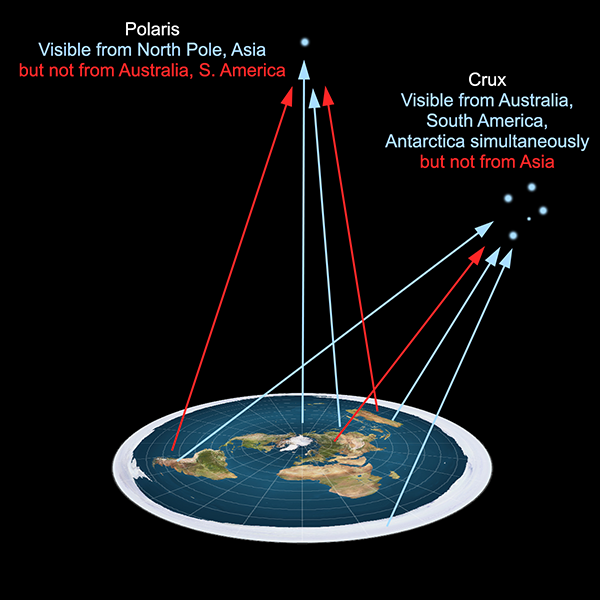
Retroreflector on the moon

Retroreflector array set up on the lunar surface by Neil Armstrong and Buzz Aldrin during the Apollo 11 mission. (Public domain image by NASA from Wikimedia Commons.)

Since 1969, several lunar laser ranging experiments have been ongoing, making regular measurements of the distance between the Earth stations and the reflectors on the moon. These measurements can also determine the distance to better than one millimetre.

If you measure the distances from either an artificial satellite or the moon to different points on the Earth’s surface, it’s trivial to show that the points don’t lie even approximately on a flat plane, but that they lie on the surface of an approximately spherical body with the radius of the Earth. Finding an explicit statement such as “This demonstrates that the Earth is not flat, but spherical” in a published scientific article is difficult (because that result is neither surprising nor groundbreaking), but the following diagram shows the model that laser ranging scientists use to correct for effects such as atmospheric refraction, to enable them to get their measurements accurate down to a millimetre.

Model of Earth used for accurate laser ranging

Atmospheric refraction model used by laser ranging scientists. (Figure reproduced from [1].)

This shows clearly that laser ranging scientists—who have explicit and direct measurements of the shape of the Earth’s surface—assume the Earth is spherical in order to refine their calculations. They’d hardly do that if the Earth were flat.

References:

[1] Degnan, J. J. “Millimeter accuracy satellite laser ranging: a review”. Contributions of Space Geodesy to Geodynamics: Technology, 25, p.133-162, 1993. https://doi.org/10.1029/GD025p0133

[2] Murphy Jr., T. W. “Lunar Laser Ranging: The Millimeter Challenge”. Reports on Progress in Physics, 76(7), p. 076901, 2013. https://doi.org/10.1088/0034-4885/76/7/076901