15. Trilateration

Trilateration is the method of locating points in space based on measuring the distances from known reference locations. It is used in surveying and navigation, similarly to the related method of triangulation, which technically uses the measurement of angles, not distances. For this entry we’re going to get practical and attempt to do some trilateration, using distances between some major cities in the world. To do this, I’ll need some equipment:

Equipment used

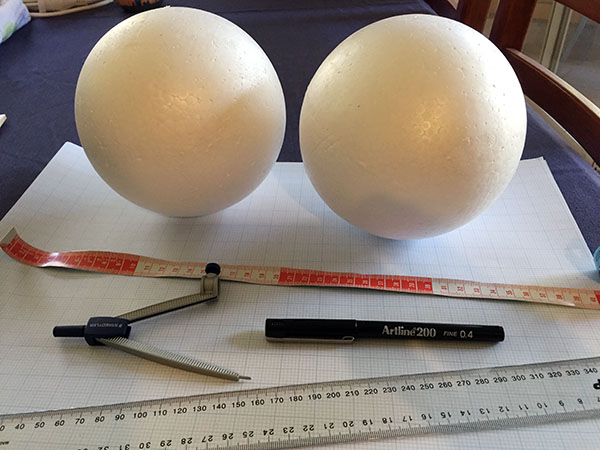
I acquired graph paper, a ruler, a tape measure, a pen, a pair of compasses, and a couple of large polystyrene balls.

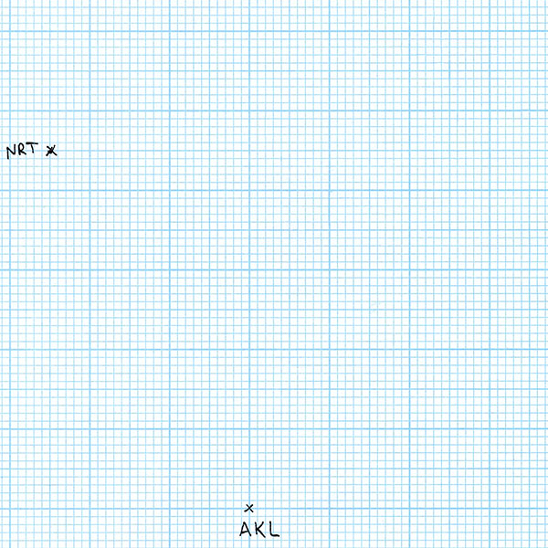
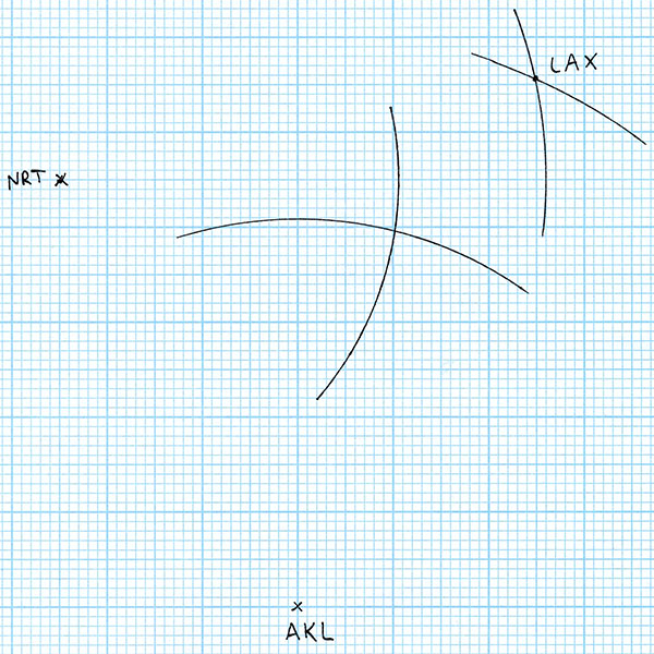
I began my first scale drawing on a piece of graph paper. I’ve picked Auckland, New Zealand, as one of my cities of interest. Since nothing is on the paper yet, I can place Auckland wherever I want to. So I draw a cross indicating the position of Auckland and label it AKL (the city’s international airport code).

Auckland's position

For my second city, I’ve chosen Tokyo, Japan. According to a flight distance reference website, the travelling distance between Auckland and Tokyo, or more specifically between Auckland Airport and Tokyo’s Narita Airport, is 8806 kilometres. My graph paper has 2 mm squares, and (for reasons that will become clear in a minute) I’m using a scale of 86.1 km/mm. So I take a pair of compasses and set the distance from the metal point to the pen tip to be 102.3 mm as best I can. That’s 51 and a bit grid squares. I place the point in the centre of the AKL cross and mark a point on the paper 102.3 mm away with the pen tip. I enlarge the point to a cross and label it NRT (for Narita Airport). It doesn’t matter which direction I choose to place Tokyo from Auckland, because at this point there are no other constraints.

Tokyo's position

For my third city, I choose Los Angeles, USA. Los Angeles Airport, LAX, is 10467 km from Auckland, and 8773 km from Tokyo Narita. To locate LAX on my scale drawing, I first set my compasses with a distance of 10467 / 86.1 = 121.6 mm. With this distance setting, I draw an arc centred on AKL.

Los Angeles' position from Auckland

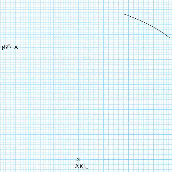
All of the points on this arc are the correct distance from Auckland to be Los Angeles. But we have another constraint – Los Angeles also has to be the correct distance from Tokyo. So I set my compasses to 8773 / 86.1 = 101.9 mm, and draw an arc centred at NRT.

Los Angeles' position nailed down

The intersection of these two arcs is the point that is both the correct scale distance from Auckland and Tokyo, so I label the intersection point LAX. So far, so good. We have three world cities with their relative positions accurately plotted to scale. Let’s add a fourth city! For the fourth city, I’ll choose something somewhere in the middle of the first three: Honolulu, USA. For starters, Honolulu is 7063 km from Auckland. So I draw an arc with radius 7063 / 86.1 = 82.0 mm centred on AKL.

Honolulu's position from Auckland

Honolulu is 6146 km from Tokyo. So I draw an arc with radius 6146 / 86.1 = 71.4 mm centred on NRT.

Honolulu's position from Auckland and Tokyo

Now in theory this is enough to give us the location of Honululu. It must be on both the arc centred at Auckland and on the arc centred at Tokyo – so it has to be at the intersection of those two arcs. But wait! We have more information than that. We also know that Honolulu is 4113 km from Los Angeles. So I draw an arc with radius 4113 / 86.1 = 47.8 mm centred on LAX.

Honolulu's position from Auckland, Tokyo, and Los Angeles

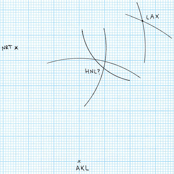
For the flight distances to be correct, Honolulu Airport (HNL) must be on all three arcs that I’ve drawn. But the arcs don’t all intersect at the same point. So where is Honolulu? According to the rules of geometry, anywhere we put it results in at least one of the distances being wrong. In the worst case, the the AKL-LAX intersection is 10 mm on the drawing from the NRT-LAX intersection, an error of 861 kilometres, which is 300 km longer than the entire chain of populated Hawaiian Islands from Niihau to Hawaii. Obviously a navigation error this large when trying to find Honolulu in the midst of the Pacific Ocean would be disastrous.

What’s gone wrong? Well, I’ve attempted to draw these distances to scale on a flat piece of paper. The error shows the distortion caused by trying to map the shape of the Earth onto a flat surface. The distances are all correct, but in reality they don’t lie in the same plane. So let’s try another approach. I’m going to map the distances onto a scale model of the Earth as a sphere.

To do this, I got a polystyrene sphere from an art supply shop. I measured the circumference using a tape measure to be 465 mm. Dividing the average circumference of the Earth by this gives me a scale of 86.1 km/mm (which is where I got the scale that I used for the drawing above). Now I just need to repeat the steps above, but plot the points and arcs on the surface of the sphere. But there’s one small wrinkle: flight distances are measured along the surface of the Earth, but the compasses step off the distance in a straight line, as measured through the Earth. To get the correct scale distance to set the compasses, we need to do a little geometry:

Geometry figure: surface distance versus straight line distance

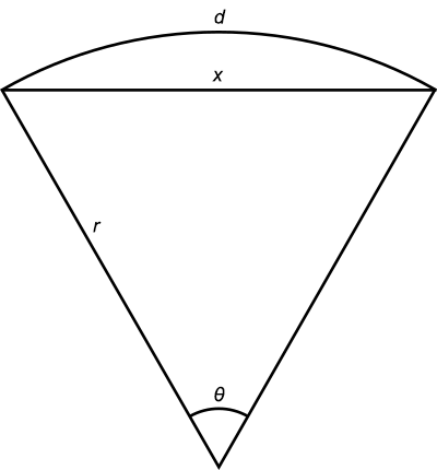
The distance along the surface of the Earth is d, the distance through the Earth is x, and the radius of the Earth is r. In radians, the angle θ is d/r. Now according to the cosine rule of trigonometry:

x2 = r2 + r2 – 2r2 cos θ

x2 = 2r2(1 – cos(d/r))

So plugging in d and r we can find the distance x to set the compasses to (at the correct scale). Here’s a summary table:

Cities Distance (km) Scale distance (mm) Compasses distance (mm)
AKL-NRT 8806 102.3 94.3
AKL-LAX 10467 121.6 108.4
NRT-LAX 8773 102.0 94.0
AKL-HNL 7063 82.1 77.9
NRT-HNL 6146 71.4 68.6
LAX-HNL 4113 47.8 46.9

Using the distances in the Compasses column on my polystyrene sphere, and following the same steps as above for the graph paper, produced this:

Honolulu's position on a sphere

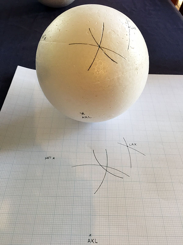
The arcs drawn with the correct scale distances of Honolulu from Auckland, Tokyo, and Los Angeles all intersect at exactly the same point on the surface of the sphere. We’ve found Honolulu!

So by experiment, trilateration of points on the Earth’s surface does not work if you use a flat surface to map the points. It only works if you use a sphere.

Addendum: I bought two spheres because I was prepared for the first attempt to be a little bit out due to any small inaccuracies or mistakes in my setting the correct compasses distances. But as it turned out I only needed the one. I was pleasantly surprised when it worked so well the first time.

14. Map projections

Cartography is the science and art of producing maps – most commonly of the Earth (although there are also maps of astronomical bodies and fictional worlds). The best known problem in cartography is that of representing the Earth on a flat map with minimal distortion.

If the Earth were itself flat, then this problem would not exist. A flat map would simply be a constant scale drawing of the flat Earth, and it woud be accurate and distortion-free at all points. But it is well known that such a map cannot be made. The reason, of course, is that the Earth is spherical, and the surface of a sphere cannot be projected onto a flat plane without some sort of distortion.

There are numerous different map projections, which render areas of the Earth onto a flat map with varying types and amounts of distortion. In all of these projections, some trade off must be made between the different goals of preservation of distances (i.e. a constant distance scale), preservation of directions (e.g. north is always up, east is always to the right), preservation of shapes (geographical regions look the same shape as they do when viewed from the air or a satellite), and preservation of areas (geographical regions of the same area appear the same area on the map). The familiar Mercator projection preserves directions at the expense of all the others, and is infamous for its large distortions of area between the polar and equatorial regions.

Mercator projection

Mercator projection map of Earth, showing gross area distortions. (Public domain image from Wikimedia Commons.)

The area distortion is apparent when you consider that Africa has an area of 30.4 million square kilometres, while North America, including Central American, the Caribbean islands, the northern Canadian islands, and Greenland, is only 24.7 million square kilometres. On a Mercator map, Greenland all by itself looks larger than Africa, but it is in reality less than a third the size of Australia.

There are projections which give a better impression of the relative areas, but these necessarily distort shapes and distances. The Gall-Peters projection also maps lines of latitude and longitude to straight lines like Mercator, but preserves areas.

Gall-Peters projection

Gall-Peters projection map of Earth, showing gross shape distortions. (Public domain image from Wikimedia Commons.)

Both of these projections have the disadvantage that distortion becomes extreme at the poles. In the Gall-Peters projection, the North and South Poles are mapped to horizontal lines spanning the width of the map, rather than to points. The Mercator projection cannot even show the poles at all, because the projection puts them at infinity.

A map specifically designed to compromise between all the various distortions is the Winkel tripel projection. This projection was adopted by the National Geographic Society as its standard world map projection in 1998 (replacing the Robinson projection, a similar compromise projection), and many textbooks and educational materials now use it.

Winkel tripel projection

Winkel tripel projection map of Earth, showing compromised distortions. (Public domain image from Wikimedia Commons.)

In the Winkel tripel projection, the lines of latitude and longitude are both curved, indicating that directions and shapes are not preserved faithfully. Areas are also distorted somewhat – Greenland looks almost the same size as Australia, even though it is less than a third the area. But all of the different distortions are moderate compared to the more extreme distortions visible in some of these features in other projections.

The Hammer projection goes further in rectifying the distance distortion issues with the polar regions, by mapping the North and South Poles to single points, as they are on Earth. However, this distorts the shapes of areas near the poles and away from the central meridian even more.

Hammer projection

Hammer projection map of Earth, showing poles mapped to points, but large shape distortions. (Public domain image from Wikimedia Commons.)

If you want to minimise distortions in a sort of T-shaped area encompassing, say, the Old World continents of Europe, Asia, and Africa, then you can do a bit better by adopting the Bonne projection. This maps a chosen so-called “standard” parallel of latitude to a circular arc, which reduces distortion along that parallel (since in reality parallels of latitude are circles, not straight lines).

Bonne projection

Bonne projection map of Earth with standard parallel 45°N, showing poles mapped to points and small distortions in Africa, Europe, Asia, but large distortions in South America, Australia, Antarctica. (Public domain image from Wikimedia Commons.)

Minimising distortions along the straight central meridian and a parallel in the northern hemisphere naturally increases distortions in the southern hemisphere, making this a good choice for Old World maps, which it has been used for extensively, but pretty bad for South America and Oceania.

Oddly enough, we’re now not so far from the standard map advocated by most Flat Earthers. If you map all the parallels of latitude to complete circles (rather than partial circular arcs as in the Bonne projection), increasing in radius by a constant amount per degree of latitude, you end up with an azimuthal equidistant projection, centred on the North Pole.

Azimuthal equidistant projection

Azimuthal equidistant projection map of Earth centred at the North Pole. (Public domain image from Wikimedia Commons.)

The result is that the northern hemisphere is moderately distorted, but the distortion grows extreme in the south, and the South Pole is mapped to a large circle encircling the whole map. This map projection is good for showing directions relative to the central point (so a variant centred on Mecca is useful for Muslims who wish to know which direction to face during prayer). It’s not a good projection for much else though, because of the severe distance, shape, direction, and area distortions in the southern hemisphere. If you were plotting a trip from Australia to South America, it would be utterly useless.

If the Earth were in fact flat, then it would be possible—indeed trivial—to construct flat maps which accurately show the shapes and distances over large areas of the Earth’s surface at a constant scale. No such maps exist. And the fact that cartographers have struggled for centuries to make flat maps of the world, trading off various compromises with arguable degrees of success, is evidence that it’s not possible, and that the Earth is a globe.