Pendulum experiment

With my Science Club class of 7-10 year olds, I did an experiment to test what factors influence the period of swing of a pendulum, and to measure the strength of Earth’s gravity. I borrowed some brass weights and a retort stand from my old university Physics Department and took them to the school. Then with the children we did the experiment!

We set up pendulums with different lengths of string, measuring the length of each one. With each pendulum length, we tested different numbers of brass weights, and pulling the weight back by a different distance so that the pendulum swung through shorter or longer arcs. For each combination of string length, mass, and swing length, I got the kids to time a total of 10 back and forth swings with a stopwatch. I recorded the times and divided by 10 to get an average swing time for each pendulum.

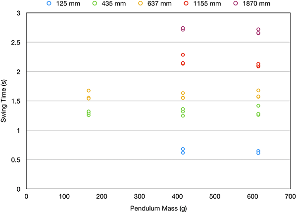
Here’s a graph showing the pendulum period (or “swing time” as I’m calling it with the kids), plotted against the mass of the weight at the end.

Pendulum period versus mass

Pendulum period versus mass. The different colours indicate different pendulum lengths.

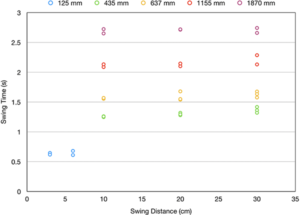
Here’s a graph showing the pendulum period (or “swing time” as I’m calling it with the kids), plotted against the swing distance (i.e. the amplitude).

Pendulum period versus swing distance

Pendulum period versus swing distance. The different colours indicate different pendulum lengths.

These first two graphs show pretty clearly that the period of the pendulum is not dictated by either the mass of the pendulum or the amplitude of the swing. If you look at the different colours showing the pendulum length, however, you may discern a pattern.

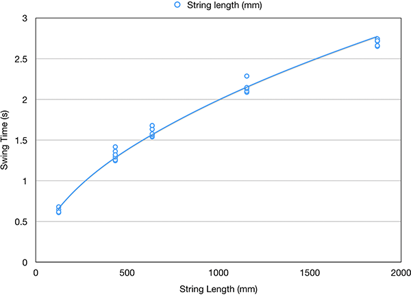
And here’s a graph showing the pendulum period plotted against the length of the pendulum.

Pendulum period versus length

Pendulum period versus length. The line is a power law fit to all the points.

In this case, all the points from different pendulum masses and swing amplitudes but the same length are clustered together (with some scatter caused by experimental errors in using the stopwatch). This indicates that only the length is important in determining the period. This matches the first order approximation theoretical formula for the period of a pendulum, T:

T = 2π√(l/g),

where l is the length and g is the acceleration due to gravity. To calculate g from the experimental data, I squared the period numbers and calculated the slope of the best fit line passing through zero to (iT2). Then g = 4π2 divided by the slope… which gives g = 10.0 m/s2.

The true value is 9.81 m/s2, so we got it right to a little better than 2%. Which I consider pretty good given the fact that I had kids as young as 7 making the measurements!

Although this is an “other science” entry on this blog and not a proof of the Earth’s roundness, I’m planning to combine the results of this experiment with our ongoing measurement of the sun’s shadow length of a vertical stick at the end of the year, to calculate not only the size of the Earth, but also its mass. It’ll be interesting to see how close we can get to that!

23. Straight line travel

Travel in a straight line across the surface of the Earth in any direction. After approximately 40,000 kilometres, you will find you are back where you started, having arrived from the opposite direction. While this sort of thing might be common in the wrap-around maps of some 1980s era video games, the simplest explanation for this in the real world is that the Earth is a globe, with a circumference about 40,000 km.

It’s difficult to see how this sort of thing could be possible on a flat Earth, unless the flat Earth’s surface were subject to some rather extreme directional and distance warping—that exactly mimics the behaviour of the surface of a sphere in Euclidean space. While this is not a priori impossible, it would certainly be an unlikely coincidence. Occam’s razor suggests that if it looks like a duck, quacks like a duck, and perfectly mimics the Euclidean geometry of a duck, it’s a duck.

This could be a very short and sweet entry if I left things there, but there are a few dangling questions.

Firstly there’s the question of exactly what we mean by a “straight line”. The Earth’s surface is curved, so any line we draw on it is necessarily curved in the third dimension, although this curvature is slight at scales we can easily perceive. The common understanding of a “straight line” on the Earth’s surface is the line giving the shortest distance joining two points as measured along the surface. This is what we mean when we talk about “straight lines” on Earth in casual speech, and it also matches how we’re using the term here.

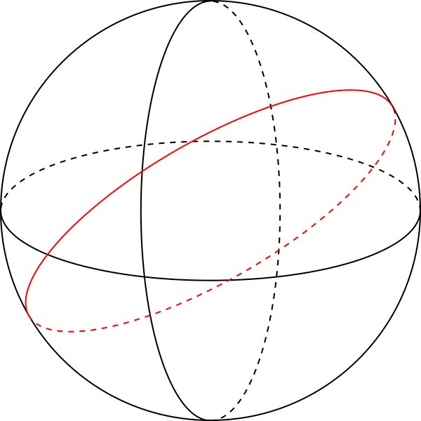
In three dimensions, such “straight lines” are what we call great circles. A great circle is a circle on the surface of a sphere that has the same diameter as the sphere itself. On an idealised perfectly spherical Earth, the equator is a great circle, as are all of the meridians (i.e. lines of longitude). Lines of latitude other than the equator are not great circles: if you start north of the equator and travel due west, maintaining a westerly heading, then you are actually curving to the right. It’s easiest to see this by imagining a starting point very close to the North Pole. If you travel due west you will travel in a small clockwise circle around the pole.

Great circles

Great circles on a sphere. The horizontal circle is an equator, the vertical circle is a meridian, the red circle is an arbitrary great circle at some other angle.

Secondly, how can we know that we are travelling in such a straight line? The MythBusters once tested the myth that “It is impossible for a blindfolded person to travel in a straight line” and found that with restricted vision they were unable to either walk, swim, or drive in a straight line over even a very short distance[1]. We don’t need to keep our eyes closed though!

When travelling through unknown terrain, you can navigate by using the positions of the sun and stars as a reference frame, giving you a way of determining compass directions. Converting this into a great circle path however requires geometric calculations that depend on the spherical geometry of the Earth, so this approach is a somewhat circular argument if our aim is to demonstrate that the Earth is spherical.

A more direct method to ensure straight line travel is to line up two landmarks in the direction you are travelling, then when you reach the first one, line up another beyond the next one and repeat the process. This procedure can keep your course reasonably straight, but relies on visible and static landmarks, which may not be conveniently present. And this method is useless at sea.

Modern navigation now uses GPS to establish a position accurate to within a few metres. While this could be (and is routinely) used to plot a straight line course, again this relies on geometrical calculations that assume the Earth is spherical. (It works, of course, because the Earth is spherical, but render this particular line of argument against a flat Earth circular.)

Before GPS became commonplace, there was a different sort of navigation system in common use, and it is still used today as a backup for times when GPS is unavailable for any reason. These older systems are called inertial navigation systems (INS). They use components that provide an inertial frame of reference—that is, a reference frame that is not rotating or accelerating—independent of any motion of the Earth. These systems can be used for dead reckoning, which is navigating by plotting your direction and speed from your starting location to determine where you are at any time. They can be used to ensure that you follow a straight line path across the Earth, with reference to the inertial frame.

Inertial navigation systems can be built using several different physical principles, including mechanical gyroscopes, accelerometers, or laser ring gyroscopes utilising the Sagnac effect (previously discussed in these proofs). These systems drift in accuracy over time due to mechanical and environmental effects. Modern inertial navigation systems are accurate to 0.6 nautical miles per hour[2], or just over 1 km per hour. A plane flying at Mach 1 can fly a great circle route in just over 32 hours, so if relying only on INS it should arrive within 32 km of its starting point, which is close enough that a pilot can figure out that it’s back where it started. So in principle we can do this experiment with current technology.

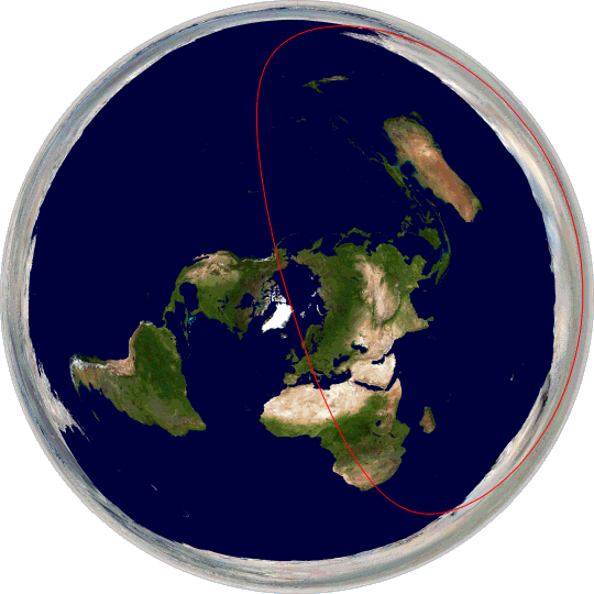
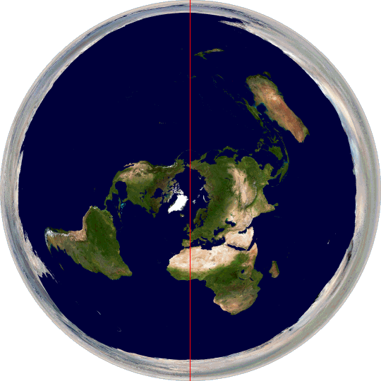
A great circle on our spherical Earth is straightforward. But what does a great circle path look like plotted on a hypothetical flat Earth? Here are a few:

Equator on flat Earth

The equator.

Great circle passing through London and Sydney

Great circle passing through London and Sydney.

Great circle passing through Rome and McMurdo Station, Antarctica

Great circle passing through Rome and McMurdo Station, Antarctica.

As you can see, great circle paths are distorted and misshapen when plotted on a flat Earth. If you follow a straight line across the surface of the Earth as given by inertial navigation systems there’s no obvious reason why you would end up tracing any of these paths, or why you would measure the same distance travelled (40,000 km) over all three paths when they are significantly different sizes on this map. And then consider this one:

Great circle passing through London and the North Pole

Great circle passing through London and the North Pole.

This circle passes through the north and south poles. If you travel on this great circle, then you have to go off one edge of the flat Earth and reappear on the other side. Which seems unlikely.

Travelling in a straight line and ending up where you started makes the most sense if the Earth is a globe.

References:

[1] “MythBusters Episode 173: Walk a Straight Line”, MythBuster Results, https://mythresults.com/walk-a-straight-line (accessed 2019-08-20).

[2] “Inertial Navigation System (INS)”, Skybrary, https://www.skybrary.aero/index.php/Inertial_Navigation_System_(INS) (accessed 2019-08-20).

22. Plate tectonics

Following the rediscovery of the New World by Europeans in the 15th century, the great seafaring nations of Europe rapidly mapped the eastern coastlines of the Americas. Demand for maps grew, not just of the New World, but of the Old as well. This made it possible for a young man (unfortunately women were shepherded into more domestic jobs) to seek his fortune as a mapmaker. One such man was Abraham Ortelius, who lived in Antwerp in the Duchy of Brabant (now part of Belgium).
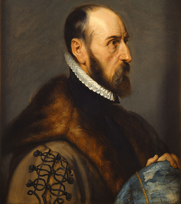
Abraham Ortelius

Abraham Ortelius, painted by Peter Paul Rubens. (Public domain image from Wikimedia Commons.)

In 1547, at the age of 20, Ortelius began his career as a map engraver and illuminator. He travelled widely across Europe, and met cartographer and mapmaker Gerardus Mercator (15 years his senior, and whose map projection we met in 14. Map projections) in 1554. The two became friends and travelled together, reinforcing Ortelius’s passion for cartography, as well as the technical and scientific aspects of geography. Ortelius went on to produce and publish several maps of his own, culminating in his 1570 publication, Theatrum Orbis Terrarum (“Theatre of the Orb of the World”), now regarded as the first modern atlas of the world (as then known). Previously maps had been sold as individual sheets or bespoke sets customised to specific needs, but this was a curated collection intended to cover the entire known world in a consistent style. The Theatrum was wildly successful, running to 25 editions in seven languages by the time of Ortelius’s death in 1598.
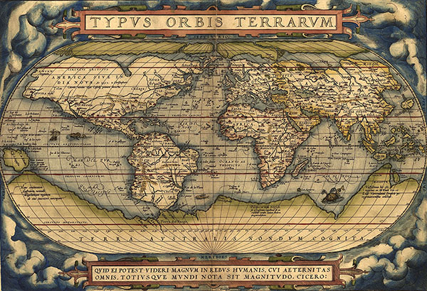
Theatrum Orbis Terrarum

World map plate from Theatrum Orbis Terrarum. (Public domain image from Wikimedia Commons.)

Being intimately familiar with his maps, Ortelius noticed a strange coincidence. In his publication Thesaurus Geographicus (“Geographical Treasury”) he wrote about the resemblance of the shapes of the east coast of the Americas to the west coasts of Europe and Africa across the Atlantic Ocean. He suggested that the Americas may have been “torn away from Europe and Africa … by earthquakes and floods. … The vestiges of the rupture reveal themselves, if someone brings forward a map of the world and considers carefully the coasts of the three.” This is the first known suggestion that the uncanny jigsaw-puzzle appearance of these coastlines might not be a coincidence, but rather a vestige of the continents actually having fitted together in the past.

Ortelius wasn’t the only one to make this observation and reach the same conclusion. Over the next few centuries, similar thoughts were proposed by geographers Theodor Christoph Lilienthal, Alexander von Humboldt, Antonio Snider-Pellegrini, Franklin Coxworthy, Roberto Mantovani, William Henry Pickering, Frank Bursley Taylor, and Eduard Suess. Suess even suggested (in 1885) that at some time in the past all of the Earth’s continents were joined in a single mass, which he gave the name “Gondwana”.
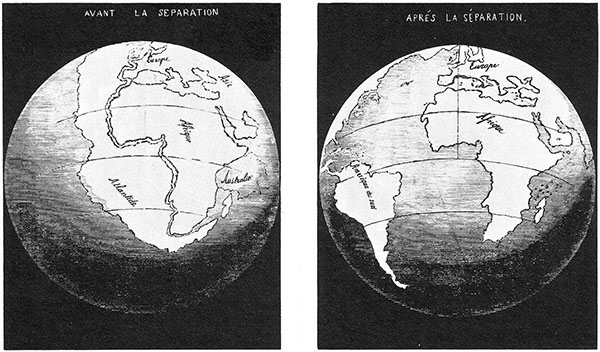
Snider-Pellegrini illustration

Illustration by Antonio Snider-Pellegrini, of his proposal that the Americas had once been adjacent to Europe and Africa. (Public domain image from Wikimedia Commons.)

Although many people had suggested that the continents had once been adjacent, nobody had produced any supporting evidence, nor any believable mechanism for how the continents could move. This changed in 1912, when the German meteorologist and polar scientist Alfred Wegener proposed the theory which he named continental drift. He began with the same observation of the jigsaw nature of the continent shapes, but then he applied the scientific method: he tested his hypothesis. He looked at the geology of coastal regions, examining the types of rocks, the geological structures, and the types of fossils found in places around the world. What he found were remarkable similarities in all of these features on opposite sides of the Atlantic Ocean, and in other locations around the world where he supposed that now-separate landmasses had once been in contact. This is exactly what you would expect to find if a long time ago the continents had been adjacent: plants and animals would have a range spanning across what would later split open and become an ocean, and geological features would be consistent across the divide as well[1].
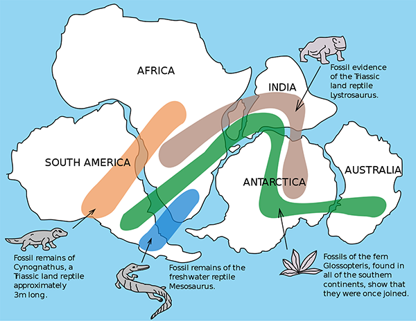
fossil distribution across continents

Map of similar fossils of non-sea-going lifeforms found across landmasses, providing evidence that they were once joined. (Public domain image from Wikimedia Commons.)

In short, Wegener found and presented evidence in support of his hypothesis. He presented his theory, with the evidence he had gathered, in his 1915 book, Die Entstehung der Kontinente und Ozeane (“The Emergence of the Continents and Oceans”). He too proposed that all of the Earth’s continents were at one stage joined into a single landmass, which he named Pangaea (Greek for “all Earth”)[2].

But Wegener had two problems. Firstly, he still didn’t know how continents could possibly move. Secondly, he wasn’t a geologist, and so the establishment of geologists didn’t take him very seriously, to say the least. But as technology advanced, detailed measurements of the sea floor were made beginning in the late 1940s, including the structures, rock types, and importantly the magnetic properties of the rocks. Everything that mid-20th century geologists found was consistent with the existence of a large crack running down the middle of the Atlantic Ocean, where new rock material was welling up from beneath the ocean floor, and spreading outwards. They also found areas where the Earth’s crust was being squashed together, and either being thrust upwards like wrinkles in a tablecloth (such as the Himalayas mountain range), or plunged below the surface (such as along the west coast of the Americas).

Confronted with overwhelming evidence—which it should be pointed out was both consistent with many other observations, and also explained phenomena such as earthquakes and volcanoes better than older theories—the geological consensus quickly turned around[3]. The newly formulated theory of plate tectonics was as unstoppable as continental drift itself, and revolutionised our understanding of geology in the same way that evolution did for biology. Suddenly everything made sense.

The Earth, we now know, has a relatively thin, solid crust of rocks making up the continents and sea floors. Underneath this thin layer is a thick layer known as the mantle. The uppermost region of the mantle is solid and together with the crust forms what is known as the lithosphere. Below this region, most of the mantle is hot enough that the material there is visco-elastic, meaning it behaves like a thick goopy fluid, deforming and flowing under pressure. This viscous region of the mantle is known as the asthenosphere.
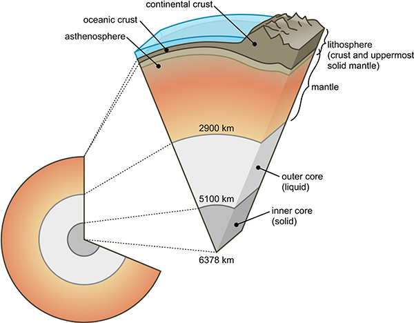
structure of the Earth

Diagram of the Earth’s layers. The lithosphere region is not to scale and would appear much thinner if drawn to scale. (Public domain image from Wikimedia Commons.)

Heat wells up from the more central regions of the Earth (generated by radioactive decay). Just like a boiling pot of water, this sets up convection currents in the asthenosphere, where the hot material flows upward, then sideways, then back down to form a loop. The sideways motion at the top of these convection cells is what carries the crust above, moving it slowly across the surface of the planet.

The Earth’s crust is broken into pieces, called tectonic plates, which fit together along their edges. Each plate is relatively rigid, but moves relative to the other plates. Plates move apart where the upwelling of the convection cells occurs, such as along the Mid-Atlantic Ridge (the previously mentioned crack in the Atlantic Ocean floor), and collide and subduct back down along other edges. At some plate boundaries the plates slide horizontally past one another. All of this motion causes earthquakes and volcanoes, which are mostly concentrated along the plate boundaries. The motion of the plates is slow, around 10-100 millimetres a year. This is too slow to notice over human history, except with high-tech equipment. GPS navigation and laser ranging systems can directly measure the movements of the continents relative to one another, confirming the speed of the motion.

The tectonic plates, then, are shell-like pieces of crust that fit together to form the spherical shape of the Earth’s surface. An equal amount of area is lost at subduction zones as is gained by spreading on sea-floors and in places such as Africa’s Rift Valley, keeping the Earth’s surface area constant. As the plates drift around, they don’t change in size or deform geometrically very much.
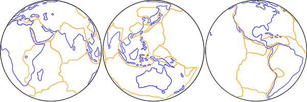
Earth's tectonic plates

Sketch of the major tectonic plates as they fit together to form the surface of the Earth.

All of this is consistent and supported by many independent pieces of evidence. Direct measurement shows that the continents are moving, so it’s really just a matter of explaining how. But the motions of the tectonic pates only make sense on a globe.

If the Earth were flat, then sure, you could conceivably have some sort of underlying structure that supports the same sort of convection cells and geological processes of spreading and subduction, leading to earthquakes and volcanoes, and so on. But look at the shapes of the tectonic plates.
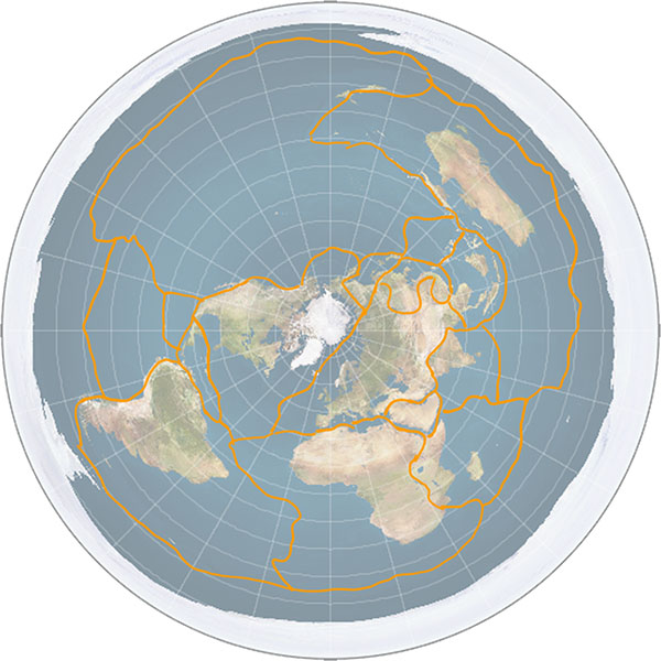
Earth's tectonic plates on a flat Earth

Sketch of the major tectonic plates on a flat Earth.

Because of the distortions in the shape of the map relative to a globe, the tectonic plates need to change shape and size as they move across the surface. Not only that, but consider the Antarctic plate, which is a perfectly normal plate on the globe. On the typical Flat Earth model where Antarctica is a barrier of ice around the edge of the circle, the Antarctic plate is a ring. And when it moves, it not only has to deform in shape, but crust has to disappear off one side of the disc and appear on the other side.

So plate tectonics, the single most fundamental and important discovery in the entire field of geology, only makes sense because the Earth is a globe.

Notes:

[1] For readers interested in this particular aspect of continental drift, I’ve previously written about it at greater length in the annotation to this Irregular Webcomic! http://www.irregularwebcomic.net/1946.html

[2] Pangaea is now the accepted scientific term for the unified landmass when all the continents were joined. Eduard Suess’s Gondwana lives on as the name now used to refer to the conjoined southern continents before merging with the northern ones to form Pangaea.

[3] Alfred Wegener is often cited by various people in support of the idea that established science often laughs at revolutionary ideas proposed by outsiders, only for the outsider to later be vindicated. Often by people proposing outlandish or fringe science theories that defy not only scientific consensus but also the boundaries of logic and reason. What they fail to point out is that in all the history of science, Wegener is almost the only such case, whereas almost every other outsider proposing a radical theory is shown to be wrong. As Carl Sagan so eloquently put it in Broca’s Brain:

The fact that some geniuses were laughed at does not imply that all who are laughed at are geniuses. They laughed at Columbus, they laughed at Fulton, they laughed at the Wright brothers. But they also laughed at Bozo the Clown.
Colour naming experiment, part 2

A couple of months ago I wrote about a colour naming experiment that I was planning to perform with the students in the Science Club that I volunteer to teach at a local primary school. You may want to go back and review that post, as today I’m going to talk about the results of the experiment.

I go back to teach the Science Club again next Monday, so it was time to sit down and analyse the results. I went through the answer sheets that the children filled (there were 12 of them, one of the students was sick that day) in and typed the names of each colour from each child into a spreadsheet. I thought it could accumulate the totals and make pie charts for me, but I discovered that I needed to manipulate the data first using a COUNT() function or something. While pondering whether to do this or to export all the data to CSV and write a Python program to do the gruntwork, one of my friends pointed me at this pertinent xkcd comic.

That inspired me to do all the processing in Python, and I discovered to my pleasant surprise that my machine already had the matplotlib library installed, so I could produce pie charts directly from Python. (Without sucking the munged data back into a spreadsheet again to to the graphs as I feared I might have to do.) Anyway, long story short, here are the results (click the image for a huge readable version):

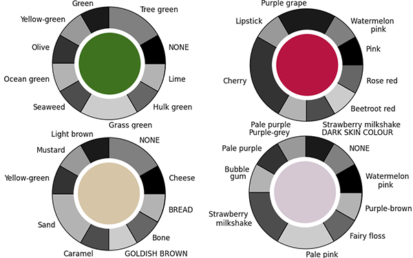
lots of pie charts

[I should point out that of course the colours in this image as displayed on your computer screen are not exactly the same as the colours printed on the paint sample charts that I assembled and gave to the children, because of the vagaries of colour calibration of monitors and the limited colour gamut of the graphic file format. Consider them only an approximation of what the children actually saw.]

That’s a lot to digest. Here are some highlights:

Firstly, here are the colours for which the largest number of people agreed on the name:

most agreed colours

Out of 12 people, three colours had 7 of them agree on what the colour should be called, and one colour had 6 people agree. There was no colour in the entire sample for which a 2/3 majority agreed on the name, let alone anything approaching unanimity. 31 of the 35 colours sampled had less than half the people agree on the name of the colour.

At the other end of the spectrum (ha ha!), here are the colours that had the most different names assigned:

most disagreed colours

Four colours had, in a sample of just 12 people, nine different colour names assigned to them. Three of these colours also had one or two students unable to decide on a name in the time allowed, and they left it blank on the answer sheet.

I should point out that names that were on the answer sheet are written in lower case with an initial capital, while names that the students chose to write-in are written in all-capitals, and “NONE” indicates a student who didn’t give that colour any name. I gave them what I thought was a generous amount of time, but some of the students complained that it was too difficult and obviously struggled to complete the task. I did ask them beforehand if any of them knew they were colourblind, and none of them did. While there are two or three somewhat bizarre names assigned (“brown” for the colour that most kids identified as “lavender” for example), I don’t see any real evidence that any of them are indeed colourblind (confusing reds and greens, for example).

Another thing you’ll notice if you examine the large image of all the pie charts is that the same colour word is used for several different colours, many times over. For example, “olive” is used to describe three different shades of green, as is “tree green”, while “carrot” is used to describe three different shades of orange, “turquoise” is used for three different shades of blue, and so on.

The conclusion from all of this? This basically confirms the research findings that I quoted in the first post on this experiment – that people are incredibly inconsistent when it comes to naming colours. If you say “olive”, or “carrot”, or “turquoise”, people have a reasonable general idea what sort of colour you mean, but many will not be thinking of the same shade of colour that you will, and will fail to pick it out of a line-up.

The second part of the experiment – showing that people are inconsistent with themselves would require me to ask the children to do this entire task a second time. I was planning on doing this, but given how much some of them complained about it the first time, I think I’ll spare them doing it again, and do something a bit more fun with them instead. Hopefully however, when I show them the results on Monday they’ll think it’s pretty amazing and cool, like I do.

20.a Rocket launch sites update

I’ve been busy this week so there won’t be a new article until next week, but today there was an interesting news article on ABC News: NASA scientists visit NT site which could eventually blast rockets to the Moon.

NASA is interested in building a rocket launch site in Australia. Where have they chosen to build it? Near Nhulunbuy, in the far north of the Northern Territory. As well as Cape York Peninsula (mentioned in 20. Rocket launch sites), this is also pretty much as close to the equator as you can get within Australia. In fact it’s even a tiny bit further north than Weipa.