Parallax of the moon, experiment update

With Proof 45 I asked readers if they would help perform an experiment to measure the parallax of the moon, and so derive a figure for the radius of the Earth. The experiment was more demanding than when we used Eratosthenes’ method, requiring helpers to stay up for much of the night and take specific photos of the moon and stars. Unfortunately this meant that only two readers contacted me to help perform the experiment, which simply isn’t enough to do it successfully, given the vagaries of weather. (The planned day was rainy here so I couldn’t be a third observer.)

So we don’t have any results to report. I may try this experiment again some time in the future, but I’ll need a significantly higher response from readers if we’re to get it to work.

Colour naming experiment, part 2

A couple of months ago I wrote about a colour naming experiment that I was planning to perform with the students in the Science Club that I volunteer to teach at a local primary school. You may want to go back and review that post, as today I’m going to talk about the results of the experiment.

I go back to teach the Science Club again next Monday, so it was time to sit down and analyse the results. I went through the answer sheets that the children filled (there were 12 of them, one of the students was sick that day) in and typed the names of each colour from each child into a spreadsheet. I thought it could accumulate the totals and make pie charts for me, but I discovered that I needed to manipulate the data first using a COUNT() function or something. While pondering whether to do this or to export all the data to CSV and write a Python program to do the gruntwork, one of my friends pointed me at this pertinent xkcd comic.

That inspired me to do all the processing in Python, and I discovered to my pleasant surprise that my machine already had the matplotlib library installed, so I could produce pie charts directly from Python. (Without sucking the munged data back into a spreadsheet again to to the graphs as I feared I might have to do.) Anyway, long story short, here are the results (click the image for a huge readable version):

lots of pie charts

[I should point out that of course the colours in this image as displayed on your computer screen are not exactly the same as the colours printed on the paint sample charts that I assembled and gave to the children, because of the vagaries of colour calibration of monitors and the limited colour gamut of the graphic file format. Consider them only an approximation of what the children actually saw.]

That’s a lot to digest. Here are some highlights:

Firstly, here are the colours for which the largest number of people agreed on the name:

most agreed colours

Out of 12 people, three colours had 7 of them agree on what the colour should be called, and one colour had 6 people agree. There was no colour in the entire sample for which a 2/3 majority agreed on the name, let alone anything approaching unanimity. 31 of the 35 colours sampled had less than half the people agree on the name of the colour.

At the other end of the spectrum (ha ha!), here are the colours that had the most different names assigned:

most disagreed colours

Four colours had, in a sample of just 12 people, nine different colour names assigned to them. Three of these colours also had one or two students unable to decide on a name in the time allowed, and they left it blank on the answer sheet.

I should point out that names that were on the answer sheet are written in lower case with an initial capital, while names that the students chose to write-in are written in all-capitals, and “NONE” indicates a student who didn’t give that colour any name. I gave them what I thought was a generous amount of time, but some of the students complained that it was too difficult and obviously struggled to complete the task. I did ask them beforehand if any of them knew they were colourblind, and none of them did. While there are two or three somewhat bizarre names assigned (“brown” for the colour that most kids identified as “lavender” for example), I don’t see any real evidence that any of them are indeed colourblind (confusing reds and greens, for example).

Another thing you’ll notice if you examine the large image of all the pie charts is that the same colour word is used for several different colours, many times over. For example, “olive” is used to describe three different shades of green, as is “tree green”, while “carrot” is used to describe three different shades of orange, “turquoise” is used for three different shades of blue, and so on.

The conclusion from all of this? This basically confirms the research findings that I quoted in the first post on this experiment – that people are incredibly inconsistent when it comes to naming colours. If you say “olive”, or “carrot”, or “turquoise”, people have a reasonable general idea what sort of colour you mean, but many will not be thinking of the same shade of colour that you will, and will fail to pick it out of a line-up.

The second part of the experiment – showing that people are inconsistent with themselves would require me to ask the children to do this entire task a second time. I was planning on doing this, but given how much some of them complained about it the first time, I think I’ll spare them doing it again, and do something a bit more fun with them instead. Hopefully however, when I show them the results on Monday they’ll think it’s pretty amazing and cool, like I do.

20.a Rocket launch sites update

I’ve been busy this week so there won’t be a new article until next week, but today there was an interesting news article on ABC News: NASA scientists visit NT site which could eventually blast rockets to the Moon.

NASA is interested in building a rocket launch site in Australia. Where have they chosen to build it? Near Nhulunbuy, in the far north of the Northern Territory. As well as Cape York Peninsula (mentioned in 20. Rocket launch sites), this is also pretty much as close to the equator as you can get within Australia. In fact it’s even a tiny bit further north than Weipa.

2.c Eratosthenes and the Flat Earth model

A reader has pointed out that we can also use the data collected in our Eratosthenes experiment to test the hypothesis that the Earth is flat and that the difference in shadows is caused by the sun being a relatively small distance from the flat Earth. And we can compare this test to a test of our round Earth hypothesis.

If the Earth is flat, and we make an observation like Eratosthenes, that a vertical stick in one location casts no shadow, while a vertical stick some distance north (or south) does cast a shadow, then we can use geometry to figure out how far away the sun must be.

Distance to the sun in a flat Earth model

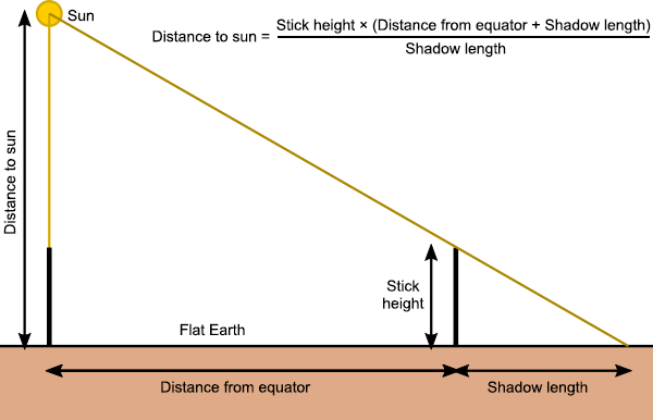
Using similar triangles to determine the distance from a flat Earth to the sun, given an observation of the shadow of a vertical stick, and knowing the distance from a point where the sun is overhead.

If the Earth is indeed flat then when we do this calculation for each of our 19 observations we should get the same answer, to within any experimental error. In particular, there should be no systematic difference in our answers that depends on the distance from the equator. Analogously, in our round Earth model, the circumference we have calculated for the Earth from each of our observations should also be the same to within experimental errors, and show no systematic difference depending on distance from the equator.

So let’s test those things! Here are graphs of the results, on which I’ve included a linear least squares best fit line, showing the line’s equation and statistical R2 score. The R2 value, or coefficient of determination, is a measure of how likely the data values (the circumference of the Earth in the round Earth hypothesis, or the distance to the sun in the flat Earth hypothesis) are to be correlated with the fixed values (the distance from the equator in both cases). We’ll discuss that after we see the data.

Earth's circumference versus distance from equator

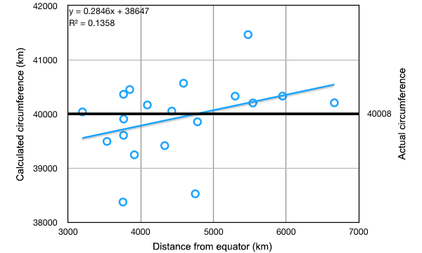
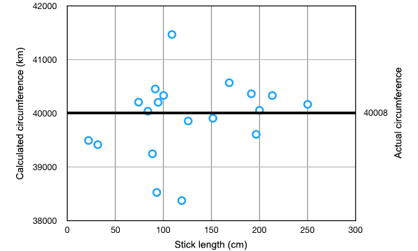
Plot of 19 measurements of the Earth’s circumference, assuming the round Earth model, versus distance from the equator.

Distance to sun versus distance from equator

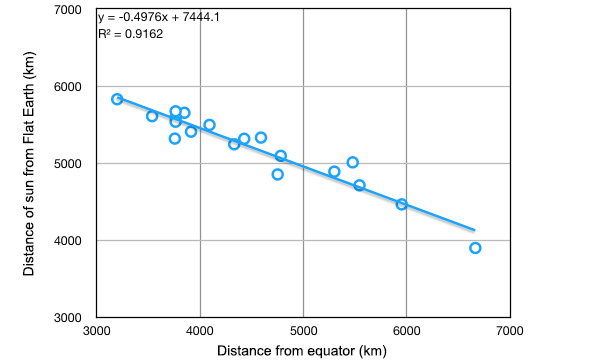
Plot of 19 measurements of the distance of the sun from Earth, assuming the flat Earth model, versus distance from the equator.

The first thing to notice is that in the top plot, the circumference of the Earth values look fairly evenly scattered around the true value. In the bottom plot, the calculated values for the distance of the sun from Earth are not evenly scattered; they show a pretty clear trend of giving larger distances for the data points closer to the equator and smaller distances for data points further from the equator. We can quantify this by looking at the straight line fits to the data and in particular the R2 value.

To do a rigorous statistical test, we need to set up our two possible null hypotheses. These are statements that for the purpose of our statistical test we assume are true, and then we calculate the probability that what we observe could happen by random chance. Our two null hypotheses are:

1. For the spherical Earth model, the calculated circumference of Earth is independent of the distance from the equator of our data points.

2. For the flat Earth model, the calculated distance of the sun from Earth is independent of the distance from the equator of our data points.

To test these, we use a probability distribution that tells us how likely our observed R2 scores are. An appropriate one to use is Student’s t-distribution. We calculate Student’s t-distribution function for 19 data points and 2 degrees of freedom (the y-intercept and the slope of our fitted line), determine a value for the function below which 95% of the probability distribution lies, and convert this to an R2 value using the known transformation. In simpler terms (TL;DR), we’re working out a number R2(P<0.05) which, if our calculated values are independent of distance from the equator, then we would expect 95% of experiments to give an R2 value less than the number R2(P<0.05).

Doing the maths, our value for R2(P<0.05) is 0.334. What this means is that if our R2 value is greater than 0.334, then we should reject our null hypothesis – the data are statistically inconsistent with the hypothesis (at the 95% confidence level, for those who like statistical rigour*). On the other hand, if our R2 value is less than 0.334, we cannot reject our null hypothesis – we haven’t proven it to be true, we have just shown that our data are consistent with it.

Now let’s look at our calculated R2 values. For the spherical Earth hypothesis, R2 = 0.1358. This is less than the critical value, so our data are consistent with our hypothesis. In contrast, for the flat Earth model, R2 = 0.9162. This is greater than the critical value, so we can confidently reject the flat Earth hypothesis as inconsistent with our experiment!

So there you have it. Not only did we successfully measure the circumference of the Earth to within our experimental errors, we have now also shown that our experimental results are consistent with a spherical Earth model, and inconsistent with a flat Earth model.

* Note: Choosing the 95% confidence level is typical for statistical hypothesis testing. You should always choose your confidence level before performing the calculations, to avoid any bias in your reporting. You can choose other levels, such as 99%. If I’d done that, we would have found that our data are also inconsistent with the flat Earth model at the more stringent 99% confidence level. In fact, calculating backwards, the confidence level of our rejection is a bit above 99.7%.

2.b Eratosthenes’ measurement results

Thank you to everyone who participated in our measurement of the Earth using Eratosthenes’ method! And thank you to those who tried but were frustrated by the weather – I received several reports of bad weather from the UK, France, and parts of the USA. But we have collected 19 successful observations, from 7 countries: New Zealand, Australia, Israel, Germany, Norway, USA, and Canada. I’ve plotted the locations of the observations on the following map.

Map of measurement locations

Map of observation locations. 16 locations are plotted; 3 of the 19 measurements were taken in the same city as another measurement.

The reason we did this experiment on the date of the equinox (20/21 March) is because that is when the sun is directly over the equator. Rather than use ancient Syene in Egypt as our reference point, where the sun is directly overhead on the summer solstice, we’re doing our calculations based on distance from the equator.

Ideally, I’d have asked all of you to measure the length of your vertical stick, the length of its shadow, and the distance you are away from the nearest point where your stick cast no shadow (which would be on the equator either due south or north of your location). Although in principle you can measure your distance from this point by travelling due south or north to the equator and keeping an accurate log of distance travelled, this would almost certainly have lowered the participation numbers! So as a proxy, I asked for your locations – either the city, or an accurate reading of your latitude from a GPS unit or Google Maps or something similar. This is really just a shortcut so that I can calculate your distance from the equator. And yes, although the existence of “degrees of latitude” is based on the premise that the Earth is spherical, the simple multiplicative relationship between distance and the numbers we call “latitude” still holds in the real world (even if the Earth is flat).

Some summary statistics:

  • Number of data points: 19
  • Shortest distance from equator: 3196 km (Geraldton, Australia)
  • Longest distance from equator: 6662 km (Oslo, Norway)
  • Shortest stick used: 31.5 cm
  • Longest stick used: 250.2 cm

The calculations proceeded as follows:

1. For each location, I calculated the distance from the equator, using the provided latitude.

2. I calculated the angle of the stick’s shadow from the vertical: shadow angle = arctangent(shadow length / stick length).

3. I calculated the circumference of the Earth for each measurement: circumference = 4 × distance from equator × 90°/(shadow angle). Here is a graph of the resulting 19 measurements of the Earth’s circumference, plotted against the length of the stick used in each case.

Map of measurement locations

Plot of 19 measurements of the Earth’s circumference, versus shadow stick length. As the sticks get longer, the results tend to get more accurate, because it is easier to measure the length of the shadow to a smaller percentage error.

4. I calculated the average of the 19 different measurements of circumference, as well as the standard error of the mean, a statistical measure of the expected uncertainty in the average value. (In experiments like this, where we take multiple independent measurements of the same value, we expect there to be some random errors in each result, caused by slight inaccuracies in measuring the lengths of the sticks and shadows. Our best overall estimate is the average of the results, and the amount of scatter in the results can be used to estimate the likely size of any error in the average.)

The result we achieved is that we measured the circumference of the Earth to be 39926 km, with a standard error of 163 km, or (39926 ± 163) km. What this means is that statistically we expect the true value to lie somewhere between 39763 km and 40089 km.

The polar circumference of the Earth is in fact 40008 km, which lies neatly within this range. So we did it! We measured the circumference of the Earth, and we got the right answer to within the statistical uncertainty of our method!

In one small wrinkle, when everyone was reporting their measurements to me, one person reported that his measurement might be a little bit wrong, because he didn’t have access to a level or any other means of ensuring that his stick was exactly vertical when he took the measurement. So he was unsure whether his data should really be included or not. As it turns out, his data produced the measurement with the largest error, the lowest data point on the graph. If we remove his measurement, our average and standard error become: (40012 ± 147) km. Our average is now even closer to the correct answer, a mere 4 km different. If we made many more measurements, being careful to minimise our random errors, we could expect our result to be even better.

So thank you again to all who participated. Now you can honestly brag that you have measured the size of the Earth!

2.a Making Eratosthenes’ measurement

Performing the experiment described in 2. Eratosthenes’ measurement.

The equinox here in Sydney occurred on 21 March, with local noon at 13:02 local time. Unfortunately the day dawned grey and rainy, with bands of heavy rain blowing in from the south.

As midday drew closer the rain eased off tantalisingly, and there was even a glimpse of blue sky, only to be followed by more heavy rain. Undaunted, a friend joined me for an expedition to a suitable location to make the measurement. I took with me my handy wizard staff to serve as the vertical stick, and a spirit level and tape measure.

We found some flat ground near the McMahons Point ferry wharf, and waited for a break in the clouds. My friend suggested that if we encountered any police and they asked why we were carrying around a quarterstaff, we should say, “Ohhh, just doing a little weather experiment”.

Waiting for the clouds to clear

Waiting for the clouds to clear.

Magically, about 15 minutes before solar noon, the clouds parted and a hot sun shone down out of the sky. We took some quick measurements in case the patchy clouds obscured the sun at the critical time, and they drifted across the sun, turning it on and off as we waited.

Fortunately, around 13:02, there was a good few minutes of uninterrupted sunshine and we measured the shadow of the staff carefully a few times, making sure the staff was held vertical with the spirit level.

Sunshine at local solar noon

Sunshine at local solar noon. Boldly doing Science!

Science successfully done, we headed to a nearby Japanese restaurant for a well-earned lunch!

I’ve been receiving measurements from all across the world today, and have run some preliminary numbers to get results. They look pretty good! But I’ll wait until everyone’s measurements are in before presenting a full report.